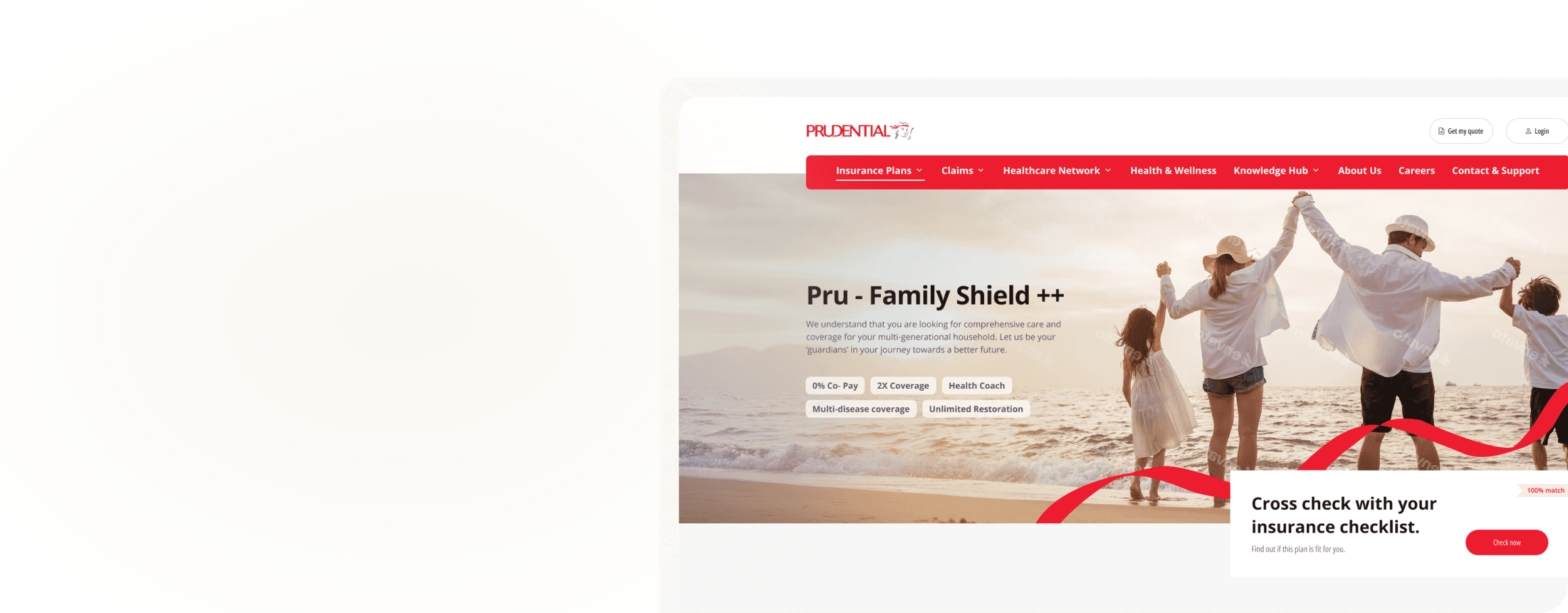
Prudential Digital Experience

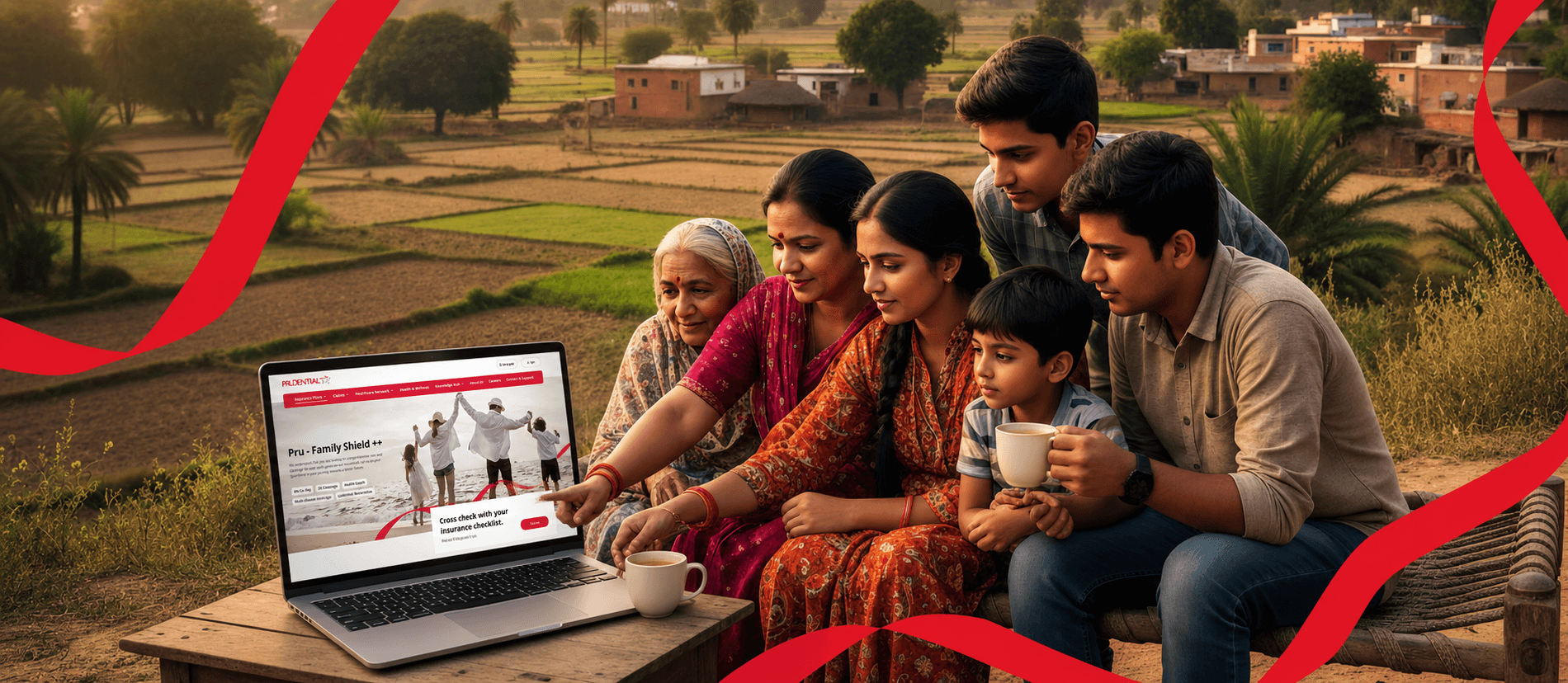
Helping a global insurer earn the trust of Indian families

Problem

Prudential is a Fortune 500 insurer with strong global brand templates. India is the world's largest under-insured market, 70% of households still uninsured, and the ones with policies often don't understand what they bought. The brand templates worked beautifully in Singapore and Hong Kong. They didn't work here.

Prudential’s global templates worked in Singapore and Hong Kong, but failed to connect with India’s deeply under-insured market.

Solution

We created a unified, human-centered ecosystem for Prudential India. By combining global consistency with local relevance, we focused on clarity, empathy, and reassurance , designing an experience that made insurance feel approachable and guided

We built a unified, human-centered ecosystem for Prudential India, blending global consistency with local relevance to make insurance feel clearer, more approachable, and reassuring.

Collaborators

Pranay Kotadia, Preet Shah, Kashika Sharma (UX Efforts)
Ripul Shah, Neha Harit, Stuti Dadia (UI Efforts)

Duration

6 Months

THE SHINY HIGHLIGHTS

PRUDENTIAL, AT A GLANCE

Static Website

Where the website's first job is to be found, and its second is to be trusted.

I] Research & Discovery

I] Research & Discovery

Understanding the Context, the Users and the scope of work

Understanding the Context, the Users and the scope of work

The Brief

The Brief

Prudential came to us with a working website. Beautiful in Singapore. Compliant in the UK. In India, it was failing two tests:

Test 1 : The Google Test

Test 1 : The Google Test

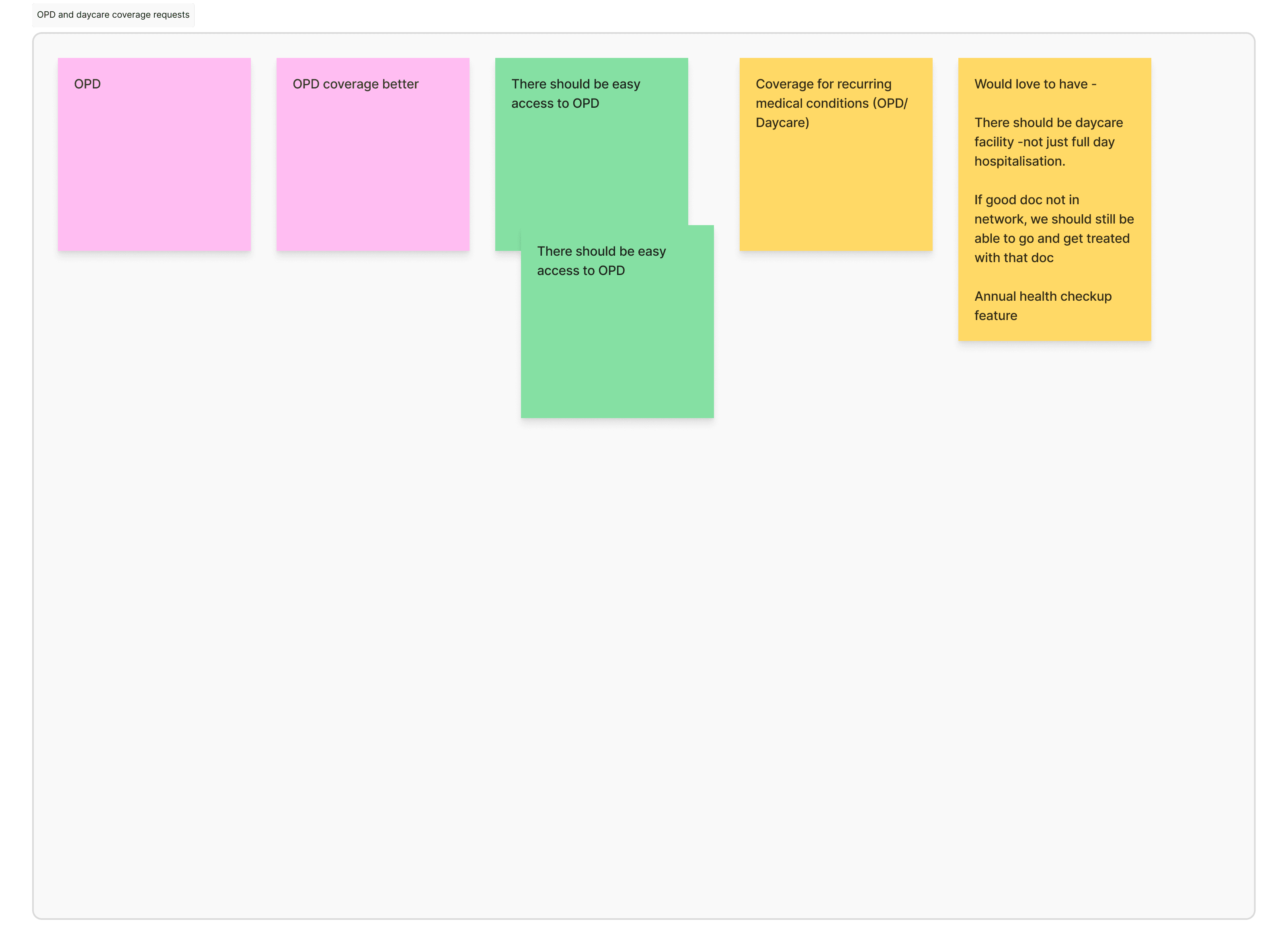
Indian users don't browse insurance sites. They Google specific terms, "diabetes insurance," "OPD coverage," "family floater 5 lakh," "is IBS covered under critical illness." Each of those searches drove ~175,000 monthly queries. Prudential India was nowhere on page one.

Test 2 : The Trust Test

Test 2 : The Trust Test

When Indian families did land on the site, they bounced. Pre-engagement research showed they didn't recognize the global brand cues, and the journey was built around the assumption that users would self-serve. In India, 75.7% of decisions still start with a conversation with a doctor.

The brief became clear: build for SEO without selling out the experience, and design for trust without losing the global brand.

What 18 Indians taught about insurance

What 18 Indians taught about insurance

Before opening Figma, we put 18 Indians from different income brackets, ages, and insurance histories in the same room. The brief: don't tell us what you think you'd do, tell us what you actually did the last time you dealt with insurance.

Six themes structured the conversation:

Warm-up & Context


Lifestyle, trust patterns, digital comfort


Current Insurance Ownership


What they had, why, and what they didn't understand.


Servicing Experience


Renewals, updates, friction with current insurer


Purchase Experience


How they researched, compared, and decided


Servicing Experience


Renewals, updates, friction with current insurer


Wellness Features


Awareness and interest in preventive add-ons

Claims Process


The single most emotional moment in any insurance relationship
18 Participants

18 Participants

Three threads ran through every conversation

  • Insurance isn't bought. It's triggered.
    Don't convince the unaware. Be there for the buyer who's just had their trigger moment.

  • Trust isn't earned. It's borrowed.

    The website's job isn't to convince. It's to validate what someone they trust already told them.

  • The decision is rational. The hesitation is emotional.

    Don't sell on features. Sell on the absence of betrayal.

50%

Scroll around

What we couldn't unsee

"Why don't they get it from us?"


Indians didn't have an insurance trust problem. They had a specific Prudential trust problem, a global brand they'd never seen on Indian TV, no family recommendation, no doctor mention.

Every design choice that followed was an answer to that question.

Secondary research : triangulating with industry data

Secondary research : triangulating with industry data

To validate the focus group findings, we cross-referenced three industry sources: Insurance Institute of India (Journal, Jan–Mar 2023), PwC's Health Insurance Consumer Pulse, and analyses of the Indian health-insurance customer segment landscape.

Primary Sources for health related Decision-Making

Doctors/ Hospitals/ Clinics

75.7%

9.3%

Digital Media

8.6%

Family/ Friends

2.9%

Print Media

Primary source for decision making has always been and continues to be doctors and healthcare specialists.

Two Digital Fluency Personas

(for omni-channel)

Two Digital Fluency Personas

(for omni-channel)

From 18 stories to 2 persona, structured along the spectrum we couldn't ignore: digital fluency. Indian insurance users don't divide cleanly by income or age, they divide by how comfortable they are doing things alone online. We mapped them on a single spectrum:

Digital native

Digital averse

Digital novice

Will prefer to use offline channels, heavily dependant on others

Will use a mix of online and offline with greater dependancy on offline

Will prefer to use online channels in self-service mode

To deliver a seamless omni-channel experience, we created 2 Digital Personas

BROWSE - PURCHASE - AVAIL SERVICES

Demographic : 28 - 32

Occupation : Working Professionals

Income : 12-32 Lpa

Digital NATIVE

These users visit the website to discover products, read customer reviews and make a research-led decision to purchase.

SELF-SERVICE ORIENTED BEHAVIOUR

INFORMATION SEEKING BEHAVIOUR

+

  • Active online, with 4-5 hours of screen time per day.

  • Uses multiple devices (smartphone, laptop, tablet)

  • Comfortable with online transactions, digital payments, and complex form filling

  • Research-oriented, reads reviews, and compares products before purchasing

APPS USED

Click on the card to FLIP for the strategies

Digital Fluency Personas

Demographic : 38 - 50

Occupation : Small Business Owners

Income : 15-45 Lpa

Demographic : 38 - 50

Occupation : Small Business Owners

Income : 15-45 Lpa

Digital NOVICE

These users visit the website to understand the company’s credibility and seek validation for what they heard from an agent.

+

CONVENIENCE ORIENTED BEHAVIOUR

TRUST SEEKING BEHAVIOUR

Moderate online activity, with 2-3 hours of screen time

Uses smartphone for basic tasks (calls, texts, WhatsApp). May struggle with complex online forms and technical terminology

Prefers assistance from family members, friends, or customer support for online tasks

Uses social media, but mostly for staying connected

APPS USED

Four customer-need personas

(for product positioning)

Four customer-need personas

(for product positioning)

Beyond digital fluency, four buying contexts emerged, each requiring a different conversion strategy. Each persona maps to a different first-fold message on the product pillar page.

Lenses used to define the personas

AGE

PERCEIVED VALUE OF HI

COVERAGE NEEDS

PRICE SENSITIVITY

Three groups lenses help us identify how to target the insured, under-insured, un-insured

Click on the card to FLIP for the strategies

Click on thetrategies

Lenses used to define the personas

AGE

PERCEIVED VALUE OF HI

COVERAGE NEEDS

PRICE SENSITIVITY

Young, Healthy & Unaware

He is unaware about the perks he may unlock if he starts young and he has limited savings in case of an unforeseen medical emergency

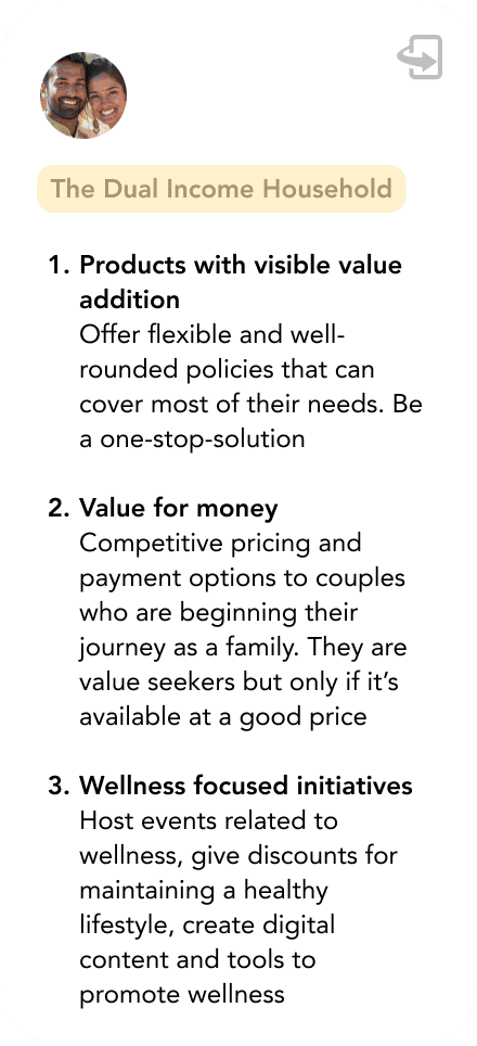
The Dual Income Household

They are looking for add-ons to their existing corporate polices because their family and their needs are expanding.

Nurturer Family

They already have a well-rounded policy covering the entire family. They would come in only if they are looking to switch in case of a better experience elsewhere / change in feature needs.

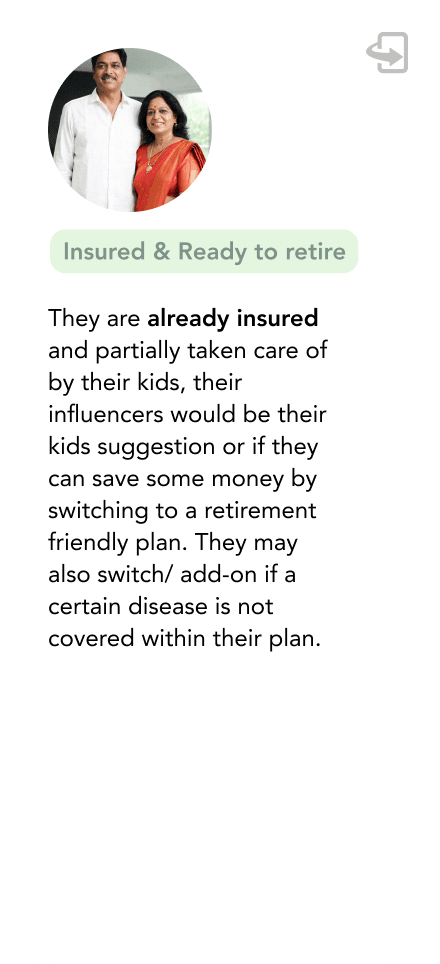
Insured & Ready to retire

They are already insured and partially taken care of by their kids, their influencers would be their kids suggestion or if they can save some money by switching to a retirement friendly plan. They may also switch/ add-on if a certain disease is not covered within their plan.

II] Ideation

II] Ideation

Three foundations: a site map, a competitive map, and a 3 workstream scope.

Three foundations: a site map, a competitive map, and a 3 workstream scope.

Site Map

Site Map

Prudential India's website serves three audiences with completely different intents, and the old IA tried to serve all three from the same navigation. Users got lost. The new sitemap separates them at the top level:

Audience

Intent

Where they go

Prospective Customers

Compare, calculate, decide

Insurance Plans → Product Pillar Pages → Plan Details → Buy Online

Existing Customers

Manage policy, file claim, track request

Servicing portal (post log-in)

Other Visitors

Careers, agents, partners, press

About Us, Careers, Media Centre

Three principles drove the map

Three principles drove the map

  • User intention and purpose : Every top-level section answers a specific user question, not a Prudential business unit

  • Information grouping : Related content lives together, even when it crosses internal team boundaries

  • Customer pathways : Multiple entry points to the same destination, because Indian users don't browse linearly

50%

Scroll Around

Ideating on Figjam

Competitive Analysis

Competitive Analysis

Before designing, we audited the entire Indian health-insurance category, both web and app experiences : across 8 competitors: Niva Bupa, Max Life Insurance, HDFC Ergo, Aditya Birla Capital, ACKO, ICICI Lombard, Care Health, and Care App.

We mapped them across six dimensions:

Purchase Journey

Product

Feature Mapping

Servicing

Wellness

Quote-to-purchase flow, friction points, drop-off triggers

How plans were displayed, compared, recommended

What every competitor offered, what nobody did

Post-login experience, claims flow, request tracking

Preventive features, health rewards, app-only experiences

What stood out

What stood out

  • Niva Bupa and Aditya Birla had the strongest purchase journeys but weakest servicing.

  • HDFC Ergo and ICICI Lombard dominated SEO with content-heavy pillar pages, high traffic, high bounce.

  • Care Health was the only competitor with a meaningful wellness offering, and they kept it inside their app, not the website.

The audit gave us a clear picture: the category was crowded with linear forms, dense pillar pages, and clunky servicing portals. A digital experience built around emotional design + assisted journeys + integrated wellness had room to win.

Competitive benchmarking

My Scope of Work

My Scope of Work

The Prudential project split cleanly into three product workstreams. Across all three workstreams, I led research (focus groups, competitive audit, persona development), drove the information architecture, and facilitated the C-suite design workshop with Prudential's CPO, CDO, and Marketing Head. My contribution varied across them

The Prudential project split cleanly into three product workstreams. Across all three workstreams, I led research (focus groups, competitive audit, persona development), drove the information architecture, and facilitated the C-suite design workshop with Prudential's CPO, CDO, and Marketing Head. My contribution varied across them


Workstream 1 : Home page, Product Pillar Page, Plan Details


Workstream 2 : Servicing Landing Page, Policy Details, Claims and Endorsements.


Workstream 3 : Solo Designed both the journeys and led the conversational journey research

Static Website

1

Servicing

Track Service Requests

2

Plan Details

Auth Journey

Raise a request

Kyc_Integration

Claims

Endorsements

Policy details and downloads

Servicing Landing Page

Plan Listing

Hospital Listing

Wellness Page

Contact Us

Category Landing (Pillar Page)

Home Page

Buy Online

3

Standard Journey [ STP/NSTP ]

Conversational Journey

Highlighted scope of work

III] The Static Website: A Game of SEO

My scope: Home page, Product Pillar Page, Plan Details

My scope: Home page, Product Pillar Page, Plan Details

The Product Pillar Page

The Product Pillar Page

In our early client meetings, we realised that SEO was the biggest deciding factor for an insurance brand’s success.

What the Competition Was Doing

What the Competition Was Doing

  • Acko drove traffic through non-insurance keywords like "baby boy names", high reach, low intent.

  • Carebus ranked with health-focused terms like "diabetes insurance."

  • Keywords like "OPD" and "Health Insurance" drew ~175K monthly searches each.

Most relied on long pillar pages, great for SEO, poor for UX. Users landed, scrolled twice, bounced.


Insight: Keep the SEO strength of long pages. Redesign the first four folds for the user that comes from Google.

Before designing, five questions

Before designing, five questions

Before opening Figma, we spent a day on a figjam. Who's landing here? What do they need? What do we need back? How should the page feel? And what would actually deliver on all of it?

By the end of the day, we had the brief that drove every fold.

Before opening Figma, we spent a day on a figjam. Who's landing here? What do they need? What do we need back? How should the page feel? And what would actually deliver on all of it?

By the end of the day, we had the brief that drove every fold.

50%

Scroll Around

Ideating on Figjam

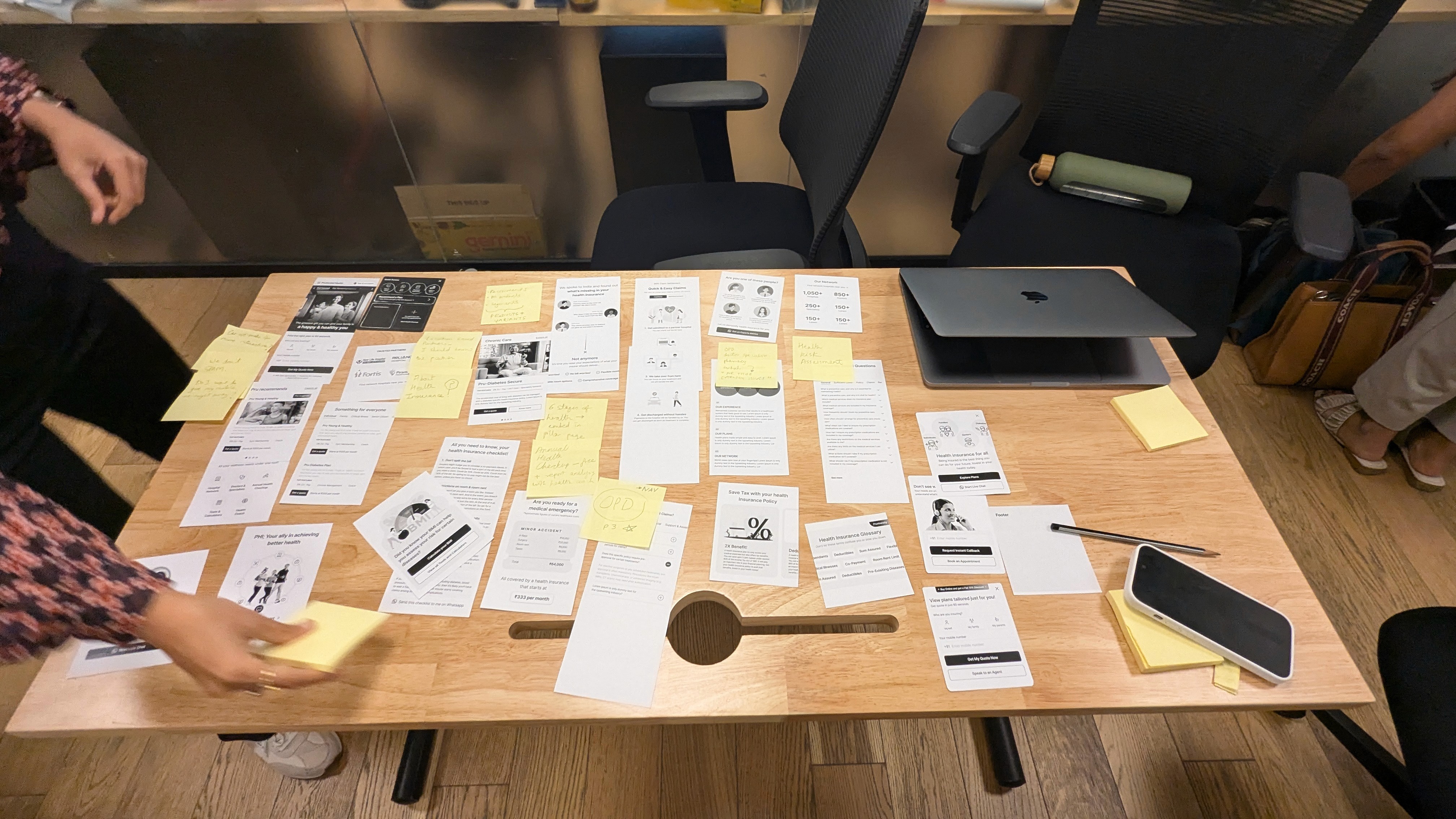
The Workshop That Decided the Folds

The Workshop That Decided the Folds

We brought Prudential's leadership into the room, CPO, CDO, and Marketing Head, and ran a half-day workshop:

  • 32 section variations for the product landing page, written and prototyped.

  • Voted on which 4 should appear in the first four folds (the part that loads above scroll).

  • Balanced SEO requirements (keyword density, heading hierarchy) against engagement principles (clarity, decision-support, trust signals)

Workshop photos: stickies on glass walls, the leadership team at a table with paper prototypes

Workshop photos

Outcome

Outcome

A product page structure that captured user attention in the first four folds, supported SEO ranking, and gave high-intent users a fast-track to conversion, all without abandoning the dense content Google rewards.

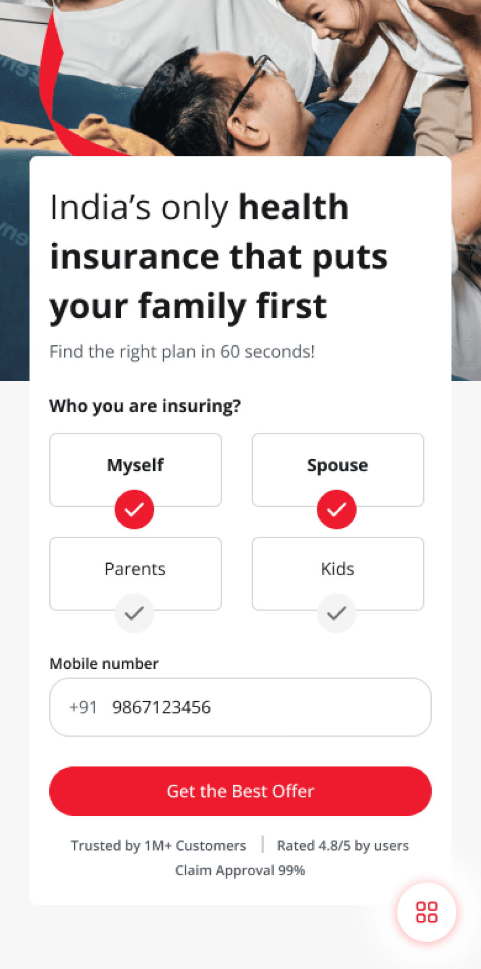
Fold 01 : The Hook

Value prop + Generate Quote form. Captures lead intent before any scroll.

Fold 2 : Pru Recommends

Recommendation cards based on family composition and most common needs. Reduces decision paralysis.

Filterable plan cards for high-intent users who already know what they want.

Fold 3 : Quick Picks

"Can I customise it?"

Long-term partner positioning. Builds the trust bridge before plan-detail comparisons.

"Will you be there?"

Fold 4 : With you every step

"Is this for me?"

"What should I buy?"

Product Pillar Page

IV] Servicing: Designing for the 11pm phone call

IV] Servicing: Designing for the 11pm phone call

My scope: Servicing Landing Page, Policy Details, Claims and Endorsements.

My scope: Servicing Landing Page, Policy Details, Claims and Endorsements.

Servicing Landing page

Servicing Landing page

Static websites are read by people considering a purchase. Servicing portals are visited by people who already paid, and now need something. The two require fundamentally different design philosophies.

Research showed three core servicing intents

Research showed three core servicing intents

  • "Did my payment go through?" Quick policy status check

  • "Something went wrong, I need help." Raise a request, track resolution

  • "I need to update something." KYC, nominee changes, policy details

The clustering exercise

The clustering exercise

The servicing portal had to handle 127 distinct items across Policy, Track Proposal, Claims, Health Management, Pending Items and Endorsements. Surfacing all of them on one screen was impossible.The clustering pattern we built:

  • My Policy4 most-used items (View Policy, Pending Items, Claims, Endorsements)

  • Track Real-time status of any open request

  • ManageUpdates, KYC, Nominee changes

  • Help → Grievance redressal, branch locator, contact support

Clusters made on Figma

The principle behind the site map

The principle behind the site map

Most servicing portals organise by policy structure, Policy, Premium, Coverage, Endorsements, Claims , because that's how the back-end thinks. We organised by user intent, track, contact, update, claim ,because that's how the user thinks.

The result: 90% of common tasks resolved within two taps, even though the underlying database had 127 unique nodes.

50%

Scroll Around

Ideating on Figjam

The Servicing Landing Page

The Servicing Landing Page

Most servicing portals dump everything onto one screen and call it a dashboard. Ours opened with a single decision: what bought you here today

Two states, depending on whether the user was checking in or filing a request:

State 1 : The check-in user


Track application · Generate new quote · Schedule appointment

State 2 The action user


View & manage my policy · Request changes in policy · Raise & track claims · Health management tools.

Service Landing Page States

Claims: where servicing gets emotional

Claims: where servicing gets emotional

Claims is the moment insurance either earns its premium or loses the customer forever. The flow had to handle four scenarios, and the user couldn't be expected to know which one they were in.

The decision tree

The decision tree

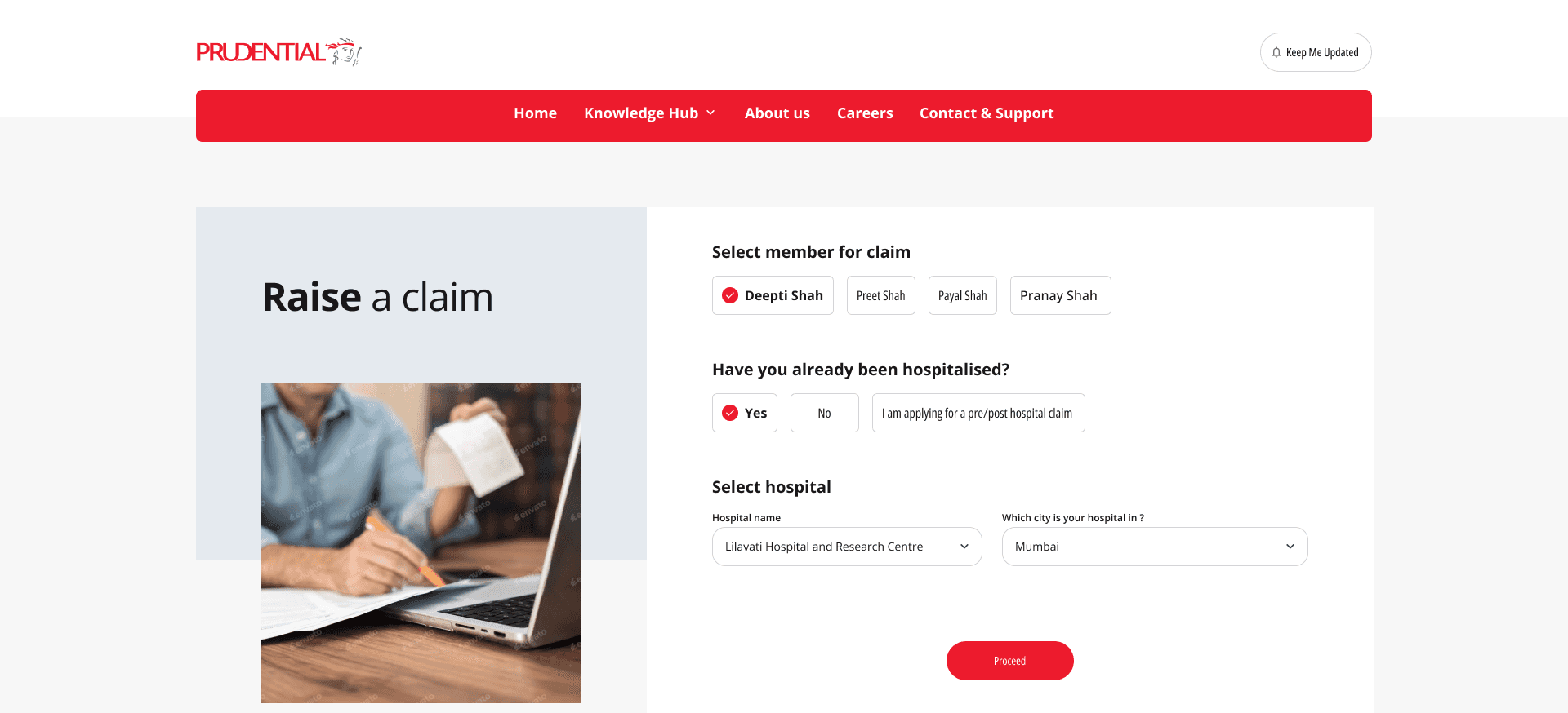
We mapped every claim path into a single branching flow. The user answers a single question (If they have been hospitalised), and the system routes them:

Raise a claim home page

Real claims aren't clean. Patients are stressed, documents are missing, hospitals push back. We designed for the friction, not around it:

The user needs to answer a few simple question and we can direct them into the appropriate flow.

Have you already been hospitalised ?

Pru Network Hospital ?

Cashless everywhere flow starts

Cashless intimation flow starts

Pre/Post Hospitlization flow starts

Cashless Claim flow starts

Register Reimbursement flow starts

Pru Network Hospital ?

YES

NO

YES

NO

I am applying for pre/post hospital claim

If the customer has already been hospitalised at a Prudential network hospital, they can opt for a cashless claim.

If the insured person was treated in a non-network hospital, they must pay first and later submit documents for reimbursement.

For an upcoming (planned) hospitalisation at a network hospital, the user can pre-authorize a cashless claim.

When the insured plans to be admitted to a non-network hospital, they can still intimate Prudential about the upcoming hospitalization.

This claim type covers medical expenses incurred before or after a hospital stay on an existing claim

YES

NO

Decision tree for claims

Raise a claim home page

Real claims aren't clean. Patients are stressed, documents are missing, hospitals push back. We designed for the friction, not around it:

The user needs to answer a few simple question and we can direct them into the appropriate flow.

Raise a claim home page

The four popups that handle the messy reality

The four popups that handle the messy reality

We mapped the flows into four contextual popups that fire based on the user's earlier answers. Each one keeps the user moving forward.


  • Popup 1 Cashless claim flow starts.

  • Popup 2 Register reimbursement flow starts.

  • Popup 3 Cashless everywhere flow starts.

  • Popup 4 Cashless intimation flow starts.

Four pop up states

Four pop up states

Pre & Post Hospitalisation

Pre & Post Hospitalisation

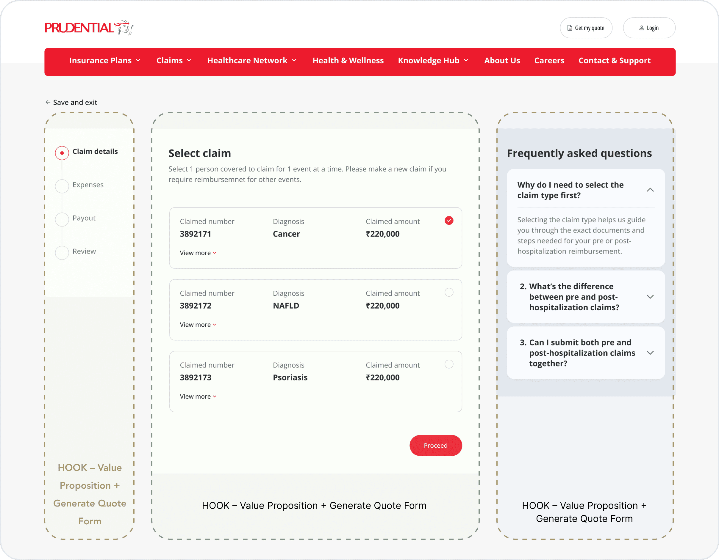
The pre/post hospitalisation flow worked differently from the others, users weren't starting fresh, they were continuing an existing claim. The desktop layout broke into three components: a progress bar, the main window, and an FAQ.

UV User Flow

Visual UI Concept

Pro post hospitalisation flow

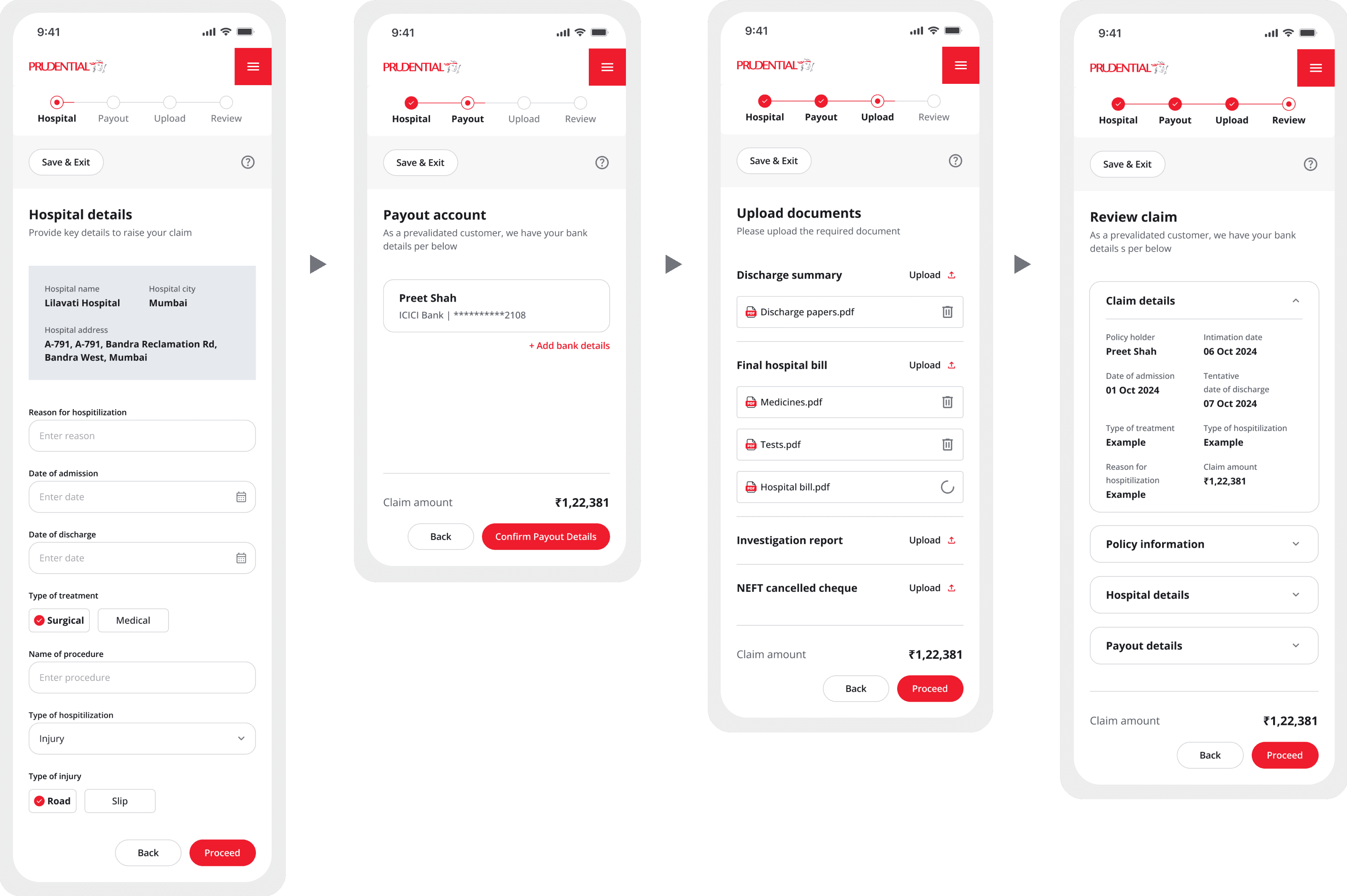
A typical claim journey, in four steps

A typical claim journey, in four steps

Claims are slow and documentation-heavy by nature. The flow had one job: capture the detail without losing the user.

1. Hospital details

Where, when, what kind of treatment

2. Payout account


Asked before documents. Trust is sequencing.

3. Upload documents


Each file with a status indicator.

4. Review claim


A summary that mirrors what the claims team sees.

Typical Claim flow

  • 1. Hospital details

    Where, when, what kind of treatment

    2. Payout account


    Asked before documents. Trust is sequencing.

    3. Upload documents


    Each file with a status indicator.

    4. Review claim


    A summary that mirrors what the claims team sees.

V] Buy Online: The two journeys experiment

My scope: Solo Designed both the journeys and led the conversational journey research

Who buys online

Who buys online

Customers who log onto the website to buy health insurance fall into two camps: those who can complete the purchase themselves, and those who need help getting through it.

Two types of buyers

Two types of buyers

  • DIY Customers (STP): Tech-savvy customers who prefer to complete the purchase on their own, no help from Prudential needed.

  • Tele-assisted Customers (NSTP): Customers who need help navigating complexities either in the interface or need help understanding the product better before buying.

Together they sit on a spectrum, from offline-only buyers we don't reach digitally, to fully self-serve users at the other end.

Mapping the journey

Mapping the journey

With the two buyer types defined, the next question was what their actual path through the site looked like, every screen, every decision, every drop-off risk.

The task flow below covers both journeys end-to-end: from landing on the site, through plan selection, underwriting, and payment.

Swipe Sideways

50%

Scroll Around

Conversational vs Standard Journey

Conversational vs Standard Journey

Half the team believed an AI-guided conversational flow would convert better, friendlier, less intimidating, more human. The other half believed a clean linear form would convert better, faster, more transparent, no "where am I in this process?" anxiety.


Rather than argue, we built both. And then we tested them.

Conversational, chat-like guided journey

Conversational, chat-like guided journey

A chat-based guided journey with one critical innovation: users picked their own assistant.

  • The Gentle Guide.
    "I know health insurance can be overwhelming. Let's take it one step at a time." Warm. Detail-oriented. Patient.

  • The Straight Shooter.
    "I'll keep it simple and to the point. Let's find the right plan and lock it in fast." Friendly. Efficient. Direct.

The hypothesis: insurance buying is emotional, and giving users control over the tone of the experience would reduce anxiety and increase completion rates, especially for the Digital Novice persona.

Choose your Assistant Screen

Introductory flow

Conversational Loader

Some Humour in the process

Some Humour in the process

Main Quote Screen

Main Quote Screen

Main Quote Screen

Standard linear form-based journey

Standard linear form-based journey

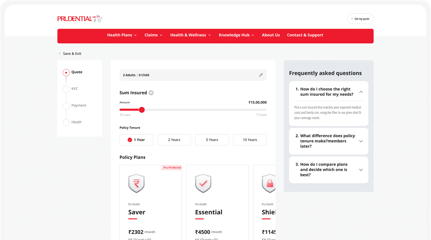
The classic e-commerce purchase pattern: Quote → KYC → Health → Payment.

  • 7 explicit steps with a persistent progress bar

  • "Save & Exit" available at every screen — insurance research happens over weeks, not minutes

  • Plan comparison surfaced at the decision moment, not buried

  • Designed for the Digital Native persona — knows what they want, wants out fast

Entry from product pillar

Loader

Loader

1.Quote


Coverage choice before price. Anchor the value, not the cost.

2. KYC


Three verification paths because India isn't one Aadhaar journey.

3. Health


A focused popup per family member, not one endless form.

4. Payment


A final glance that mirrors what the policy team will see.

buy Online Main Screens

  • 1.Quote


    Coverage choice before price. Anchor the value, not the cost.

    2. KYC


    Three verification paths because India isn't one Aadhaar journey.

    3. Health


    A focused popup per family member, not one endless form.

    4. Payment


    A final glance that mirrors what the policy team will see.

Main quote Screen

Every competitor showed the entire health questionnaire upfront every question, every family member, all at once. We did two things differently


  • Replaced the long per-member form with a focused popup that opened when a family member was selected.

  • Split the questions into sections

  1. Family overview

Tap a member, do their questions.

2. Personal details

Asked before documents. Trust is sequencing.

3. Lifestyle questions

Habits framed as routine, not interrogation.

4. Medical questions

The hard questions, last after momentum is built.

Buy online Health sub-journey

Usability Testing

Usability Testing

During the usability testing session, I served as the moderator, guiding participants through tasks using specific user interfaces. As participants completed each task, I carefully observed their behavior and actively listened to their feedback.

Objective

Objective

To assess and compare the experience of two proposed digital purchase journeys for health insurance:

• Flow 1: Standard linear form-based journey

• Flow 2: Conversational, chat-like guided journey


The goal was to identify which approach better serves diverse user needs, while uncovering opportunities for refinement or hybridisation.

Participant Overview

Who we tested with

Total participants

8

Age

21–33

Years

Insurance Experience

Mixed

First-time buyers, corporate insurance holders, and users with prior experience in both online and call-assisted purchases

Participants prefered a blend of self-serve and assisted journeys, influenced by users' digital fluency and personality type

The Strategic Recommendation: A Guided Hybrid Flow

The Strategic Recommendation: A Guided Hybrid Flow

Based on the findings, neither journey is universally superior. Each caters to different user mindsets. We recommend a hybrid approach that combines the strengths of both models.

  • Conversational tone layered onto a clean, form-based design

  • Optional tele-assistance, triggered on-demand instead of by default

  • The tele-assistant's role is supportive guide, not pushy salesperso

This was the recommendation we delivered to Prudential. It scaled across both digital personas, retained the SEO and accessibility advantages of a structured form, and respected users' need for emotional support without forcing it on them.

VI] Impact in motion

Where the design meets reality, and what we're measuring as it does.

Where the design meets reality, and what we're measuring as it does.

Post Launch Metrics

For Prudential, design had to move numbers. Before any screen was designed, I pushed the team to define winning across four areas:

  • SEO beat the 40–50% industry engagement baseline and cut bounce rates nearly in half

  • Conversiontwo journeys for two user types, each benchmarked against best-in-class insurance flows

  • Servicing 90% of tasks in 2 taps, measured through CSAT, call duration, and self-service completion

  • Business acquisition growth, CPA reduction, and an NPS well above the industry benchmark of 22

Every target was grounded in category data, not guesswork. It was benchmarked against comparable products, so the client had a clear bar to build towards.

The redesign vs. the old site

Organic traffic

2.5×

Unpaid search sessions on pillar pages, equal pre/post windows

Grew search visibility without the dense pages SEO usually demands

Rankings held through restructure

Drivers — one chain: clarity → self-service → satisfaction

First-fold engagement

65%

Scroll past hero

Baseline: 40–50%

Self-service completion

75%

Task completion rate

CSAT on servicing

4.3/5

Customer satisfaction

Pre-launch baseline: 3.6/5

Targets set before designing — benchmarked to category data

Quote-to-purchase

8–10%

Conversion rate

Benchmark: ~6%

Digital native

<6 min

Time to complete purchase

Digital novice

<12 min

Time to complete purchase

Post Launch Metrics

Reflections

Reflections

What worked

What worked

The two-journeys experiment was the right call.

  • Building both flows resolved a debate that would have stalled in slides.

  • The hybrid we shipped wouldn't have existed without seeing both fail in different ways.

The C-suite workshop changed how I work with clients.

  • Running 32 variations through a vote turned leadership into co-designers.

  • They had skin in the outcome.

What I'm taking with me

What I'm taking with me

People don't visit insurance websites because they want to. They visit because something's at stake. Every screen has a person behind it who is, on some level, anxious.

The best decisions on Prudential weren't the cleverest. They were the ones that respected that anxiety. Ananya/Aarav, the 11pm servicing portal, "Save & Exit" everywhere. Not features. Ways of saying "we've got you."

Post Launch Metrics

For Prudential, design had to move numbers. Before any screen was designed, I pushed the team to define winning across four areas:


  • SEO beat the 40–50% industry engagement baseline and cut bounce rates nearly in half

  • Conversiontwo journeys for two user types, each benchmarked against best-in-class insurance flows

  • Servicing 90% of tasks in 2 taps, measured through CSAT, call duration, and self-service completion

  • Business acquisition growth, CPA reduction, and an NPS well above the industry benchmark of 22


Every target was grounded in category data, not guesswork.t was benchmarked against comparable products, so the client had a clear bar to build towards.

Check Out Other Projects

Other Projects

Ashish 28

Energetic, fitness conscious, social

The Resilient Go-Getter

Struggles to balance an active lifestyle with flare-ups, conscious of appearance, finds strict routines frustrating

Flexible care strategies, motivational tracking, community support

Seema 36

Busy professional, caregiver, family woman

The Overwhelmed Multitasker

No time for frequent appointments, stress-induced flare-ups, hesitant to change diet

Simple guided routines, stress-management techniques, meal planning help
Ashish 28

Reserved, practical, stability over change

The Experinced Warrior

Feels psoriasis is a lifelong struggle, skeptical about new treatments, avoids socialising in events

Personalized coaching, discreet solutions, empathetic community engagement

Key takeaways from the Interviews

Dr Reddy’s Daily Bloom

Dr Reddy’s Daily Bloom

Making psoriasis care and UV therapy simpler, more engaging, and easier through an app.

View Project

64

64

x

PIF Design System

PIF Design System

Designing a scalable design system that keeps teams aligned across platforms and products.

View Project

Static Website

Where the website's first job is to be found, and its second is to be trusted.

Let's connect & make something great!

Let's connect !

I'm always open to new opportunities, collaborations, and connections. Whether you have a project you'd like to discuss, want to share your work, or just say hi! Feel free to reach out.

Open to collaborations, projects, and new connections. Feel free to reach out or just say hi.

@2025 • Made with heart, hustle, and a few too many ‘just one more tweak’ moments by Pranay

@2025 • Made with heart, hustle, and a few too many ‘just one more tweak’ moments by Pranay

Prudential Insurance

Helping a global insurer earn the trust of Indian families