Problem
Solution
Role
Co-designed the system end-to-end with one other product designer while shipping the consumer-facing interfaces in parallel.
Duration
2 Months, alongside a contract role with McKinsey.
THE SHINY HIGHLIGHTS
ATLAS AT A GLANCE

I] The thing I kept hearing
PIF's Smart City Hub runs international architecture competitions on behalf of the Saudi government, and the platform we were building had to host the whole messy workflow across two other products with a deadline that didn't move.
I wasn't planning to build a design system. Then in week two an engineer asked me which [Button] to use because there were already three of them in the file, and a week later a PM circled the same form field on three different screens and asked whether it was the same component or three different things. The honest answer to both was "I don't know."
We audited Material 3, Carbon, and Polaris before writing a single token. Each was excellent in its context, but none fit ours.
Material 3 carried Google's brand DNA in ways PIF couldn't ship
.Carbon was the closest philosophical fit, government grade and accessible. Its component
library was deeper than we needed in some places and shallower in the niche places we needed most, like jury scoring and weighted submissions.Polaris was beautiful but built for ecommerce.
II] Foundations
Atomic design has three tiers. We added a fourth underneath called sub atoms: typography, spacing, radius, color, shadows, the things most systems file away as tokens in a documentation appendix.
We promoted them to a tier of their own at the top of the file structure, which sounds pedantic but changed how the team worked.
Designers stopped reaching for raw hex values.
Engineers stopped hand coding
padding:12pxEvery conversation now had to first reference a sub atom, and if the sub atom didn't exist, that became the conversation worth having first.
We landed on a four part dot notation pattern: [category].[concept].[role].[modifier]. So a button background is color.surface.primary.default, and the same on hover is color.surface.primary.hover.
No values in names
color.brand.500is forbidden,color.brand.primaryis required. Values change, roles don't.No direction in spacing
space.leftis forbidden,space.inline.startis required. That's the lever that makes bilingual support automatic everywhere downstream.
Together, these two rules meant we could retheme the product, swap brand colors, and flip the language without touching a component file.
four part dot notation pattern
A button with a leading icon in English needs the icon on the left. The same button in Arabic needs it on the right. Same component, same token, different rendering.
We encoded direction into spacing tokens themselves: space.inline.start and space.inline.end instead of space.left and space.right. The system reads document direction at runtime and resolves automatically, so components never need to know which language they're in.
III] Design System
The vocabulary below components. Tokens for typography, spacing, color, radius, shadows, and breakpoints, the values everything else inherits. Sub atoms aren't components yet, they're the raw material components are made of.
We documented eight sub-atom token sets here, each one named according to the same four part convention. If a sub atom doesn't exist, no atom can quietly invent it.
Examples from the system
Below are a few selected examples from the design system, showcasing how semantic tokens were written, structured, and documented across different Sub-atom primitives.


Ashish 28
Energetic, fitness conscious, social
The Resilient Go-Getter
Struggles to balance an active lifestyle with flare-ups, conscious of appearance, finds strict routines frustrating
Flexible care strategies, motivational tracking, community support
Seema 36
Busy professional, caregiver, family woman

The Overwhelmed Multitasker
No time for frequent appointments, stress-induced flare-ups, hesitant to change diet
Simple guided routines, stress-management techniques, meal planning help
Ashish 28
Reserved, practical, stability over change

The Experinced Warrior
Feels psoriasis is a lifelong struggle, skeptical about new treatments, avoids socialising in events
Personalized coaching, discreet solutions, empathetic community engagement
Key takeaways from the Interviews
'Spacing' tokens
(the ones that handle bilingual)
space.inline.start.tight = 8px
space.inline.start.cozy = 12px
space.inline.start.comfy = 16px
space.inline.start.loose = 24px
space.inline.end.tight = 8px
space.inline.end.cozy = 12px
& So on

spacing
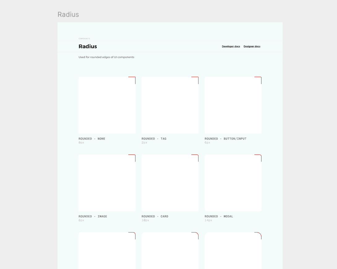
'Radius' tokens
radius.surface.card= 12px
radius.surface.modal= 8px
radius.surface.button= 8px
radius.surface.input= 8px
radius.surface.badge= 8px
radius.surface.image= 8px
& So on
Radius
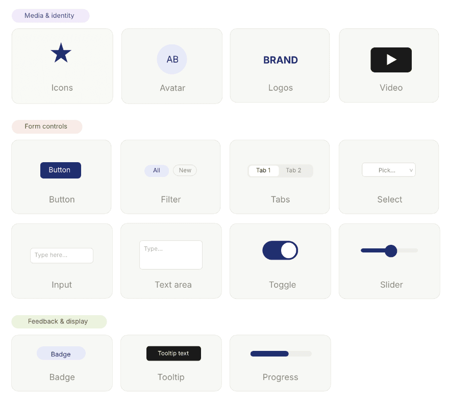
The smallest functional pieces of the interface. A button is an atom, an input is an atom, a badge is an atom. Each one does one thing, takes its values from sub atoms, and ships with every variant and state baked in.
We landed at around fifteen atoms, each documented with its full state matrix, default, hover, active, focus, disabled, loading, error. The point isn't that an atom is small. The point is that it's complete on its own.
Examples from the system
Below are a few selected examples from the design system, showcasing how semantic tokens were written, structured, and documented across different Atom components. It also shows token properties that help with state management, such as default, hover, active, and so on.
Ashish 28
Energetic, fitness conscious, social
The Resilient Go-Getter
Struggles to balance an active lifestyle with flare-ups, conscious of appearance, finds strict routines frustrating
Flexible care strategies, motivational tracking, community support
Seema 36
Busy professional, caregiver, family woman
The Overwhelmed Multitasker
No time for frequent appointments, stress-induced flare-ups, hesitant to change diet
Simple guided routines, stress-management techniques, meal planning help
Ashish 28
Reserved, practical, stability over change
The Experinced Warrior
Feels psoriasis is a lifelong struggle, skeptical about new treatments, avoids socialising in events
Personalized coaching, discreet solutions, empathetic community engagement
Key takeaways from the Interviews
'Button' token property
button.variant = default | secondary | destructive
button.size = sm | default | lg | icon
select.state = default | hover | focus | loading | disabled | pressed
Visual Tokens
button.default.backgroud.default
button.secondary.backgroud.hover
button.destrcutive.backgroud.focus
button.ghost.backgroud.loading
& So on

Button (Scroll Around)
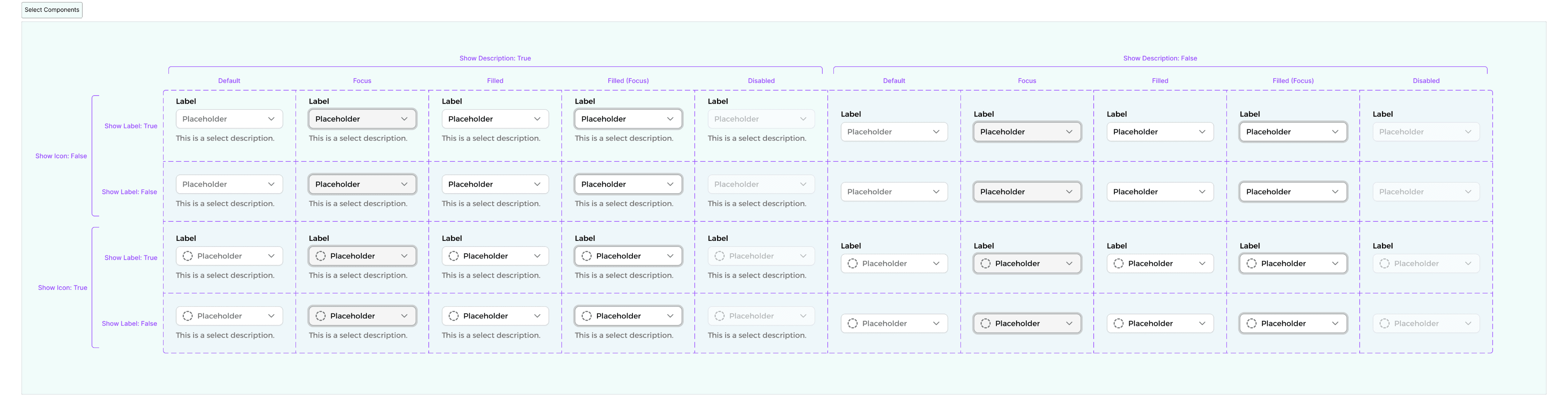
'Select' token property
select.show-icon = true | false
select.border.filled = true | false
select.text.label = true | false
select.text.label.disabled =
default | focus | filled | filled-focus | disabled
Visual Tokens
select.backgroud.default
select.border.filled
select.text.label
select.text.label.disabled
& So on
Select (Scroll Around)
Combinations of atoms that solve one specific UI problem. The atom answers "what's the smallest piece," the molecule answers "what's the smallest useful piece."
Around twenty molecules in the library, each one assembled from atoms we'd already designed.
Examples from the system
Below are a few selected examples from the design system, showcasing how semantic tokens were written, structured, and documented across different molecule components. It also shows token properties that help with state management, such as default, hover, active, and so on.

Ashish 28
Energetic, fitness conscious, social
The Resilient Go-Getter
Struggles to balance an active lifestyle with flare-ups, conscious of appearance, finds strict routines frustrating
Flexible care strategies, motivational tracking, community support
Seema 36
Busy professional, caregiver, family woman
The Overwhelmed Multitasker
No time for frequent appointments, stress-induced flare-ups, hesitant to change diet
Simple guided routines, stress-management techniques, meal planning help
Ashish 28
Reserved, practical, stability over change
The Experinced Warrior
Feels psoriasis is a lifelong struggle, skeptical about new treatments, avoids socialising in events
Personalized coaching, discreet solutions, empathetic community engagement
Key takeaways from the Interviews
'Checkbox' token property
checkbox.active = active | inactive
checkbox.state = default | focus | disabled | pressed
checkbox.show-text = true | false
checkbox.show-description = true | false
Visual Tokens
checkbox.background.inactive
checkbox.background.disabled
checkbox.border.inactive
checkbox.border.focus
checkbox.icon.checkmark
checkbox.text.label
& So on

Checkbox (Scroll Around)
'Switch' token property
switch.variant = default | box
switch.state = default | focus
switch.active = on | off
switch.label-position = left | right
Visual Tokens
switch.track.background.off
switch.track.background.on
switch.track.background.on.disabled..dis
switch.box.background.
switch.box.border
& So on

Switch (Scroll Around)
Organisms are where the system meets the product, and where the system gets tested hardest, because organisms are the things users actually look at.
Eleven organisms, built from molecules and atoms underneath them. By the time we got to this tier, almost every decision had already been made one or two layers down. That's the point of the architecture: the further up the stack you go, the fewer choices you should have to make.
Examples from the system
Below are a few selected examples from the design system, showcasing how semantic tokens were written, structured, and documented across different organism components. It also shows token properties that help with state management, such as default, hover, active, and so on.

Ashish 28
Energetic, fitness conscious, social
The Resilient Go-Getter
Struggles to balance an active lifestyle with flare-ups, conscious of appearance, finds strict routines frustrating
Flexible care strategies, motivational tracking, community support
Seema 36
Busy professional, caregiver, family woman
The Overwhelmed Multitasker
No time for frequent appointments, stress-induced flare-ups, hesitant to change diet
Simple guided routines, stress-management techniques, meal planning help
Ashish 28
Reserved, practical, stability over change
The Experinced Warrior
Feels psoriasis is a lifelong struggle, skeptical about new treatments, avoids socialising in events
Personalized coaching, discreet solutions, empathetic community engagement
Key takeaways from the Interviews
'Combobox' token property
combobox.show-avatar = true | false
combobox.show-label = true | false
combobox.show-description = true | false
combobox.show-group-label = true | false
combobox.state = default | hover | focus | disabled | pressed
Visual Tokens
combobox.background.default
combobox.border.hover
combobox.text.focus
combobox.icon.chevron
combobox.avatar.size
& So on

Combobox (Scroll Around)
'Card' token property
card.variant = non-operational-devco | non-operational-pif | operational
card.lifecyle-stage = L1 | L2 | L3 | L4 | L5
card.status = on-track | at-risk | validate | live
card.show-image = true | false
card.show-kpi = true | false
Visual Tokens
card.backgroud
card.text.tittle
c
card.text.kpi.value
card.badge.status.live
& So on

Card (Scroll Around)
IV] Governance
Anyone could propose a new component by opening a thread in #design-system with a screenshot of the unmet need. Every Friday, the team triaged proposals into one of three outcomes.
Use the existing component differently. The most common outcome.
Extend the existing component. Second most common.
New component warranted. The rarest, and the only path that opened a build ticket.
Communication ran on three channels.
Slack release notes for every change, written like a changelog.
A 30 minute open Tuesday office hour for whoever wanted to ask anything.
Notes panels inside the Figma components themselves, explaining what each was for and what it explicitly wasn't for.
When something had to die, it got a: [deprecated] prefix in Figma, a Slack release note, and a 30 day migration window before archive. We deprecated four components in eight weeks.
V] Reflection
Naming
I budgeted a day; it took two weeks. Every name encodes a decision about what's a category and what's a variant.
Bilingual edge cases
Arabic isn't English flipped. Numbers stay LTR inside RTL paragraphs, punctuation behaves differently, and date pickers needed two genuinely different mental models. Encoding direction at the token layer solved 80%. The last 20% was hand tuning.
Sub atoms as a visible tier.
People stopped designing in pixels and started designing in tokens.
Encoding direction into spacing tokens early.
Cost a week, saved a month.
Friday triage.
Lightweight enough nobody dreaded it, structured enough it killed bad requests.
Component Reuse
80%
Target (≥80% sessions)
Baseline: 30–40%
Design-to-handoff
-60%
faster than pre system baseline, measured per screen
Products consuming atlast
2/3
One in private beta
One shipped
One yet to adobpt
Three hero Metrics
Ashish 28
Energetic, fitness conscious, social
The Resilient Go-Getter
Struggles to balance an active lifestyle with flare-ups, conscious of appearance, finds strict routines frustrating
Flexible care strategies, motivational tracking, community support
Seema 36
Busy professional, caregiver, family woman
The Overwhelmed Multitasker
No time for frequent appointments, stress-induced flare-ups, hesitant to change diet
Simple guided routines, stress-management techniques, meal planning help
Ashish 28
Reserved, practical, stability over change
The Experinced Warrior
Feels psoriasis is a lifelong struggle, skeptical about new treatments, avoids socialising in events
Personalized coaching, discreet solutions, empathetic community engagement
Key takeaways from the Interviews