pranaykotadia.
Mobile app for Dr. Reddy’s, 2024–25

Designing Daily Bloom

Helping people with psoriasis stay on a treatment they usually give up on
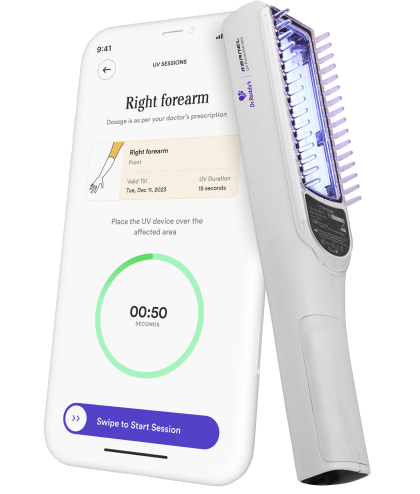
In the appDaily meal plans,At-home UV therapy,Photo symptom tracking,Coach connect,Wellness exercises,Diet challenges,Tips and resources
Adherence
68%adherent at week 8, against a published 31.5–62%
Activation
91%finished device setup
Usability
78.4SUS score, up from 71.2
Engagement
3m 40smedian session length
RoleLed UX and UI end to end, from research to launch
TeamAtharva Telang on UI, with Dr. Reddy’s medical team
Timeline8 months, 0 → 1
PlatformMobile app with an at-home UV-B device
/ The problem

The treatment works, but patients stop using it.

Dr. Reddy’s asked for a companion app for its at-home UV-B device. The device handles the dose. The app had to cover everything else about living with a lifelong, visible condition.

Pain point 01
“I only open it when it flares.”Apps came out during flare-ups and went away when symptoms eased.
Pain point 02
“I just want to eat what I like.”Diet advice ignored Indian kitchens and packed schedules.
Pain point 03
“Is the treatment even working?”Change is slow, and patients worry while they wait between dermatologist visits.
31.5–62%published adherence to treatmentPublished studies
85 → 51%adherence in eight weeks, while treatment was still runningOne eight-week study
16patients in Mumbai, Delhi and PuneInterviews
“I barely go out anymore. People stare at my skin, and I can’t even wear what I like.”
A patient, in our interviews
How might we

How might an app make patients want to come back tomorrow?

Lifelong, visible, no cureA medical device plus a clinical relationshipClinical sign-off on every piece of content8 months, 0 → 1
/ Research approach

Talking to 16 patients before designing anything
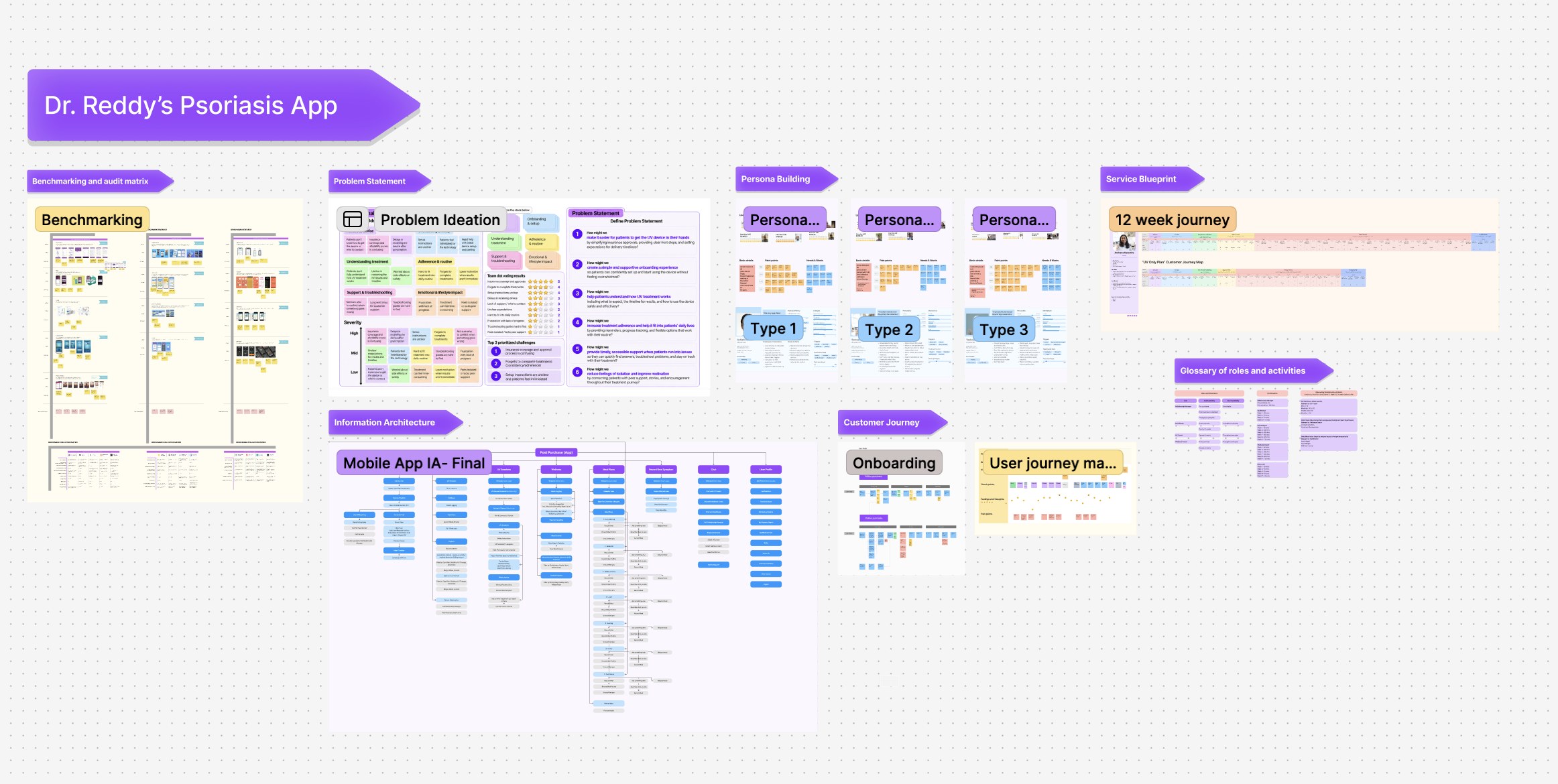
Semi-structured interviewsInterviewed 16 psoriasis patients in Mumbai, Delhi and Pune about treatment, flare-ups and daily routines.
Competitive benchmarkingAudited apps in 3 categories, symptom trackers, CBT and habit apps, for what kept people coming back.
Affinity mappingClustered 100 interview interpretations into three themes and three personas.
Journey mappingMapped two purchase flows and the 12-week care plan to find where patients drop off.
Usability testingRan 2 rounds with the same 6 patients on 11 tasks, and shipped 8 fixes in between.
The Daily Bloom research board in FigJam: benchmarking and audit matrix, problem ideation, three personas, the 12-week service blueprint, the mobile app information architecture and the onboarding journey.
The research board in FigJam: benchmarking, problem ideation, personas, information architecture, journeys and the 12-week service blueprint
/ Research findings

Most of the hard parts weren’t medical

11 of 16 patientsPeople only track when they flare up.

Apps came out during flare-ups and went away when symptoms eased.

13 of 16 patientsCare is hard for practical, emotional and cultural reasons.

Indian diets, busy parents and caregivers, people staring. Next to all that, the medicine was easy.

14 of 16 patientsApps treat the disease and ignore the person.

Every app tracked symptoms. None of them asked what it’s like to live with psoriasis.

People only track during flare-ups
Who I designed for
AshishAshish, 28The Resilient Go-Getter

Energetic, fitness conscious, social. Flare-ups get in the way of his lifestyle, and strict routines frustrate him.

Needs flexible care and motivational tracking→ Gets the UV sessions card on Home

SeemaSeema, 36The Overwhelmed Multitasker

Professional and caregiver. No time for appointments; stress triggers her flares.

Needs simple routines and meal planning help→ Gets the Diet plan card on Home

RaviRavi, 56The Experienced Warrior

Twenty years in. Skeptical of new treatments; avoids social events.

Needs discreet, personal coaching→ Gets the Wellness card on Home
Design principles

Turning the themes into design principles

Research findingsEvidenceDesign principles
People only track during flare-ups
11 of 16opened apps only during flare-ups
Make it a three-minute daily routine instead of a trackerChapter 02: Home
Care is hard for practical, emotional and cultural reasons
13 of 16found the medicine the easy part
Base the diet on Indian meals, and don’t punish missed logsChapter 04: Diet
Apps treat the disease and ignore the person.
14 of 16said apps tracked symptoms, not them
Give them a score that moves, and a coach who knows their caseChapter 01: Onboarding
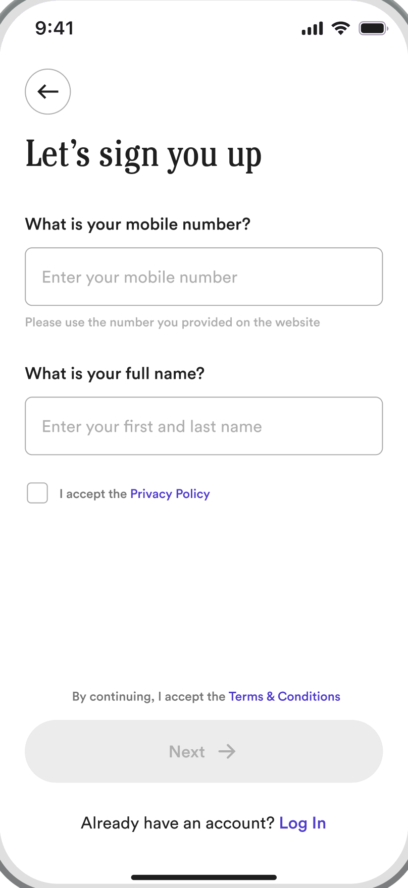
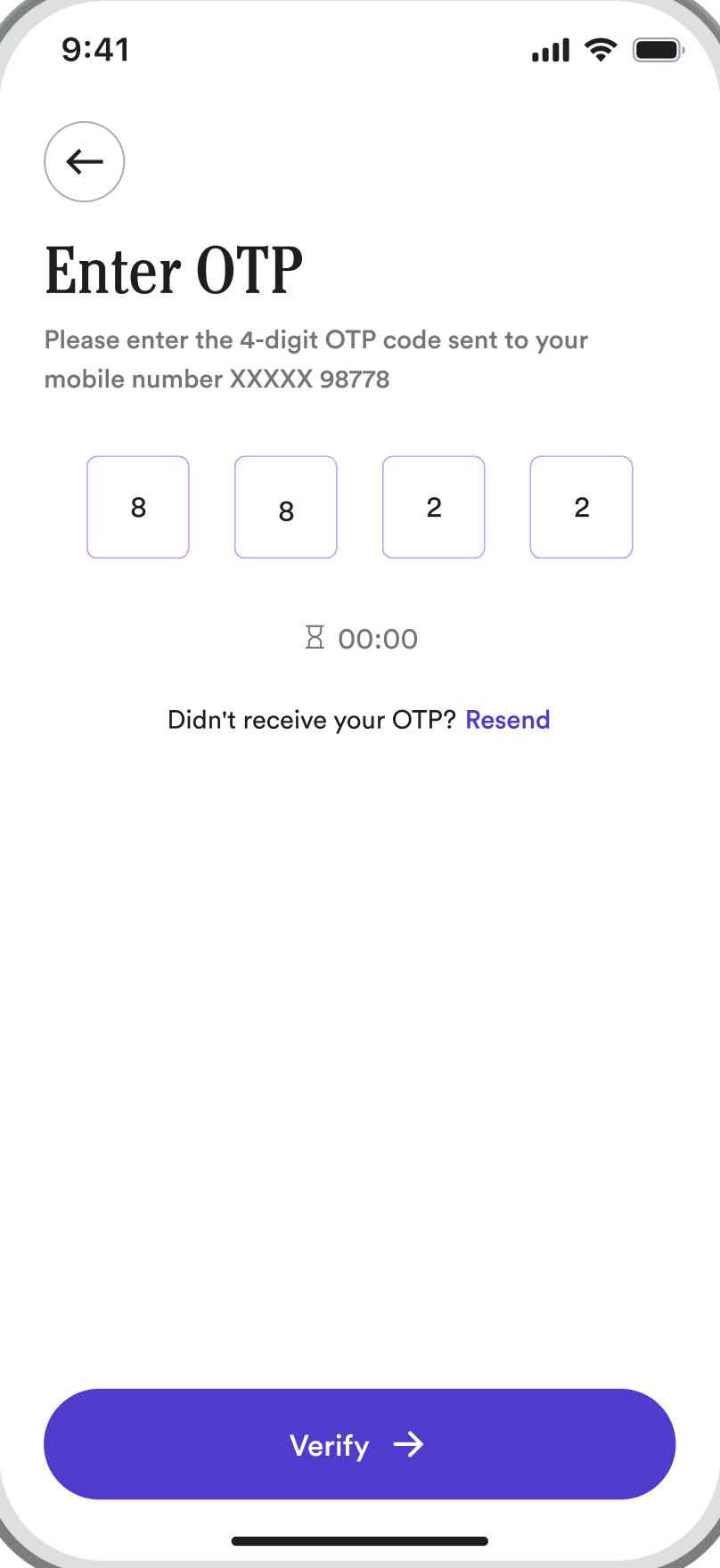
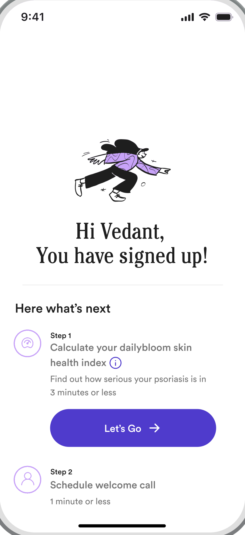
Onboarding01]

A brand mark from a psoriasis plaque

Built on Theme 03: apps ignore the person

Basing the brand on the condition

The raised psoriasis plaque became the brand mark. It sits on the splash screen and flattens a little with every onboarding step, so the brand feels familiar instead of clinical.
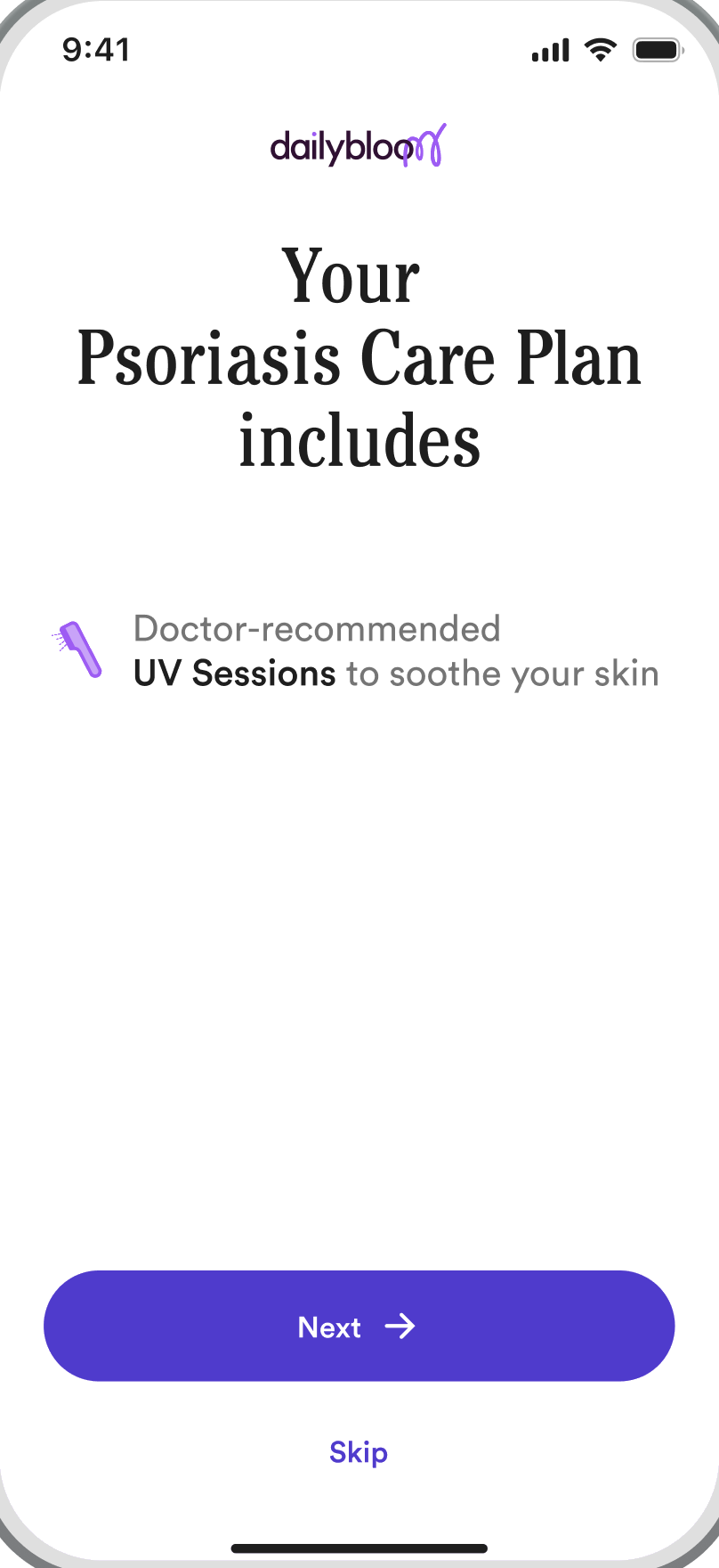

A psoriasis plaque: raised skin under a layer of scalesThe bump and its scales became the brand shapeEach onboarding step flattens the bump a little moreOnce signed up, the curve turns into a welcome

Ending on a score instead of a feature tour

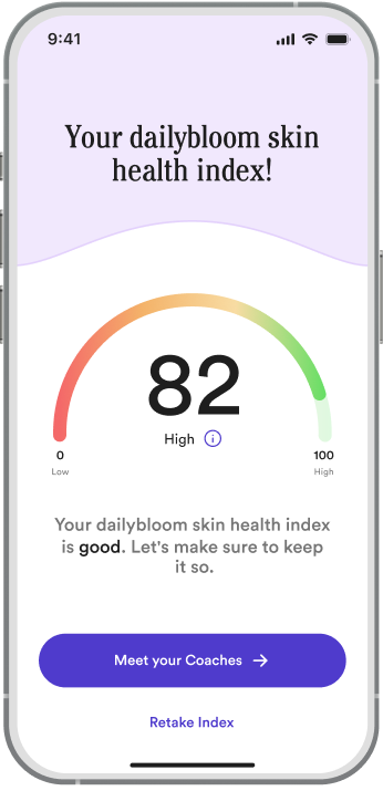
Onboarding ends with a personal Skin Health Index. It gives people a baseline, and a reason to come back and watch it change.
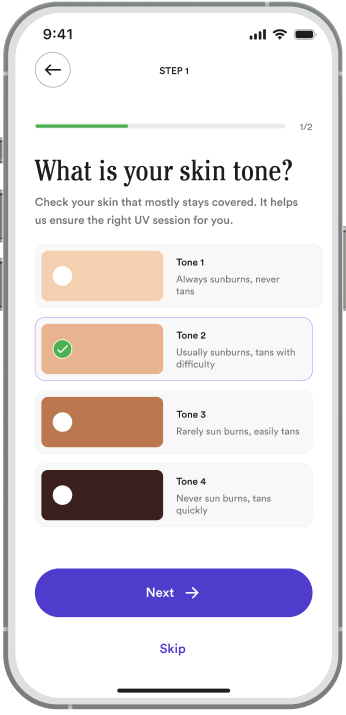
Skin tone step: four skin tones to choose from, with Tone 2 selected.
Defining skin tone
The dailybloom skin health index gauge showing a score of 82, High.
Psoriasis score
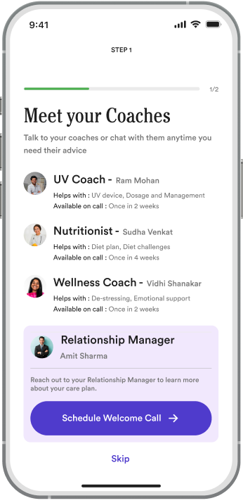
Meet your coaches: UV coach, nutritionist, wellness coach and a relationship manager.
Meet your coaches
Key onboarding screens
From our earlier iterations
✕ Earlier iterationA feature tour
✓ What we choseEnd onboarding on a Skin Health Index
BecauseA baseline gives patients a reason to come back and watch it move.
Home02]

One screen, three first actions

Built on The three personas

A site map built around five jobs

Most health apps are organised around clinical categories. We organised Daily Bloom around what people are trying to do when they open it.

Home“Where am I in my care plan today?”
UV sessions“Run my therapy session safely.”
Diet“What can I eat that won’t trigger a flare?”
Wellness“Help me deal with how this feels.”
Chat“Talk to someone who knows my case.”

A Home card for each persona

Each card on Home answers one persona’s need: UV and the photo journal for Ashish, the diet plan for Seema, a low-effort mood log for Ravi.
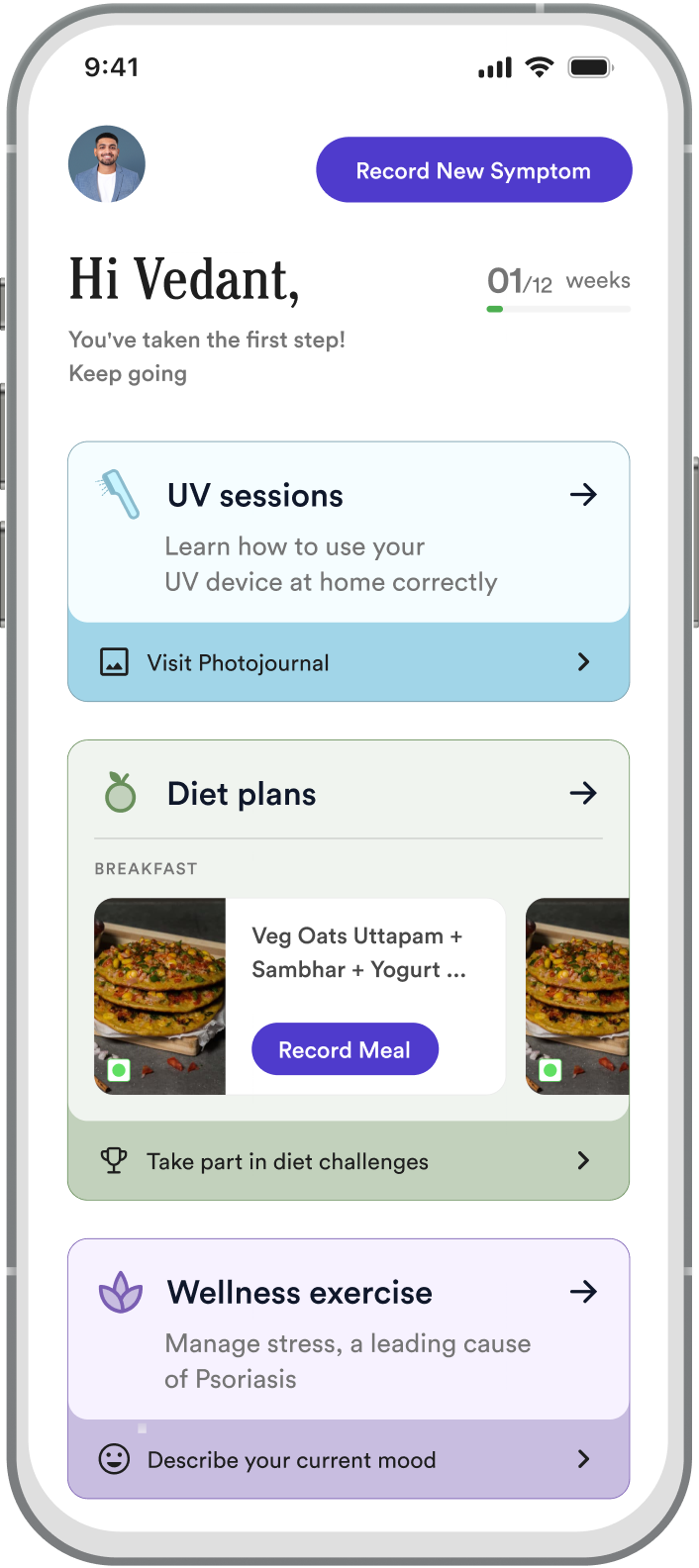
Ashish, 28The Resilient Go-GetterNeeds motivational tracking
→ UV sessions + photojournal
Seema, 36The Overwhelmed MultitaskerNeeds meal planning help
→ Diet plan, one-tap Record Meal
Ravi, 56The Experienced WarriorNeeds discreet, personal support
→ Private mood check-in
From persona to home screen: research, persona, need, card

Designing for edge cases

The UV card had to handle four states without breaking the three-minute routine. Each one tells the patient exactly what to do next.

First time, so it guides the first session
Returning, with the next session on the widget
Test not done yet, so it asks for that first
Redness reported, so UV pauses for safety
UV sessions03]

The highest-stakes feature

Built on Safety first, then habit

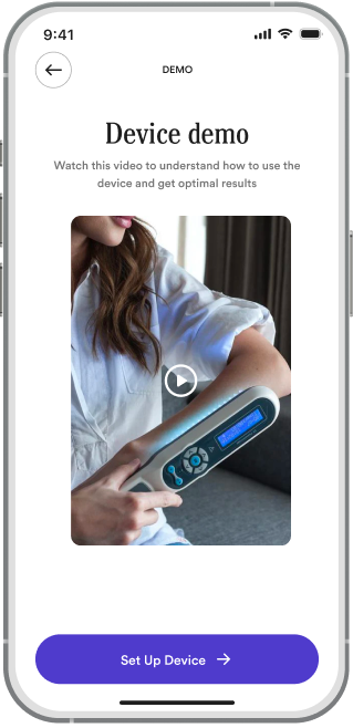
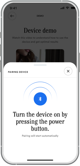
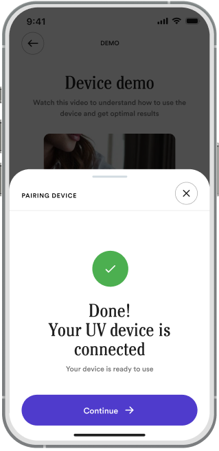
Pairing a medical device without a manual

Four steps, each with a clear fallback, so a patient opening the box at home isn’t stuck at the first Bluetooth prompt.
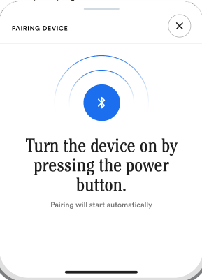
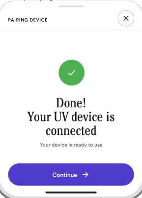
Pairing the device
01 Watch the demo
02 Pair over Bluetooth
03 Connected
04 First session

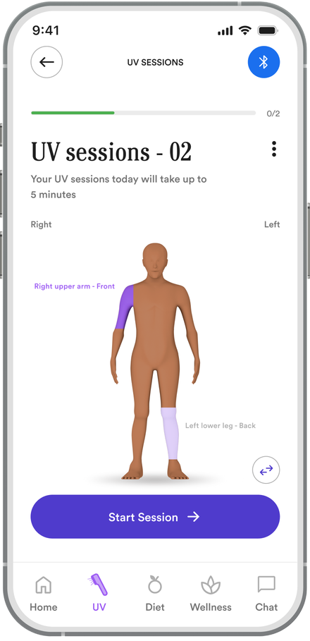
Showing dosage on a body map

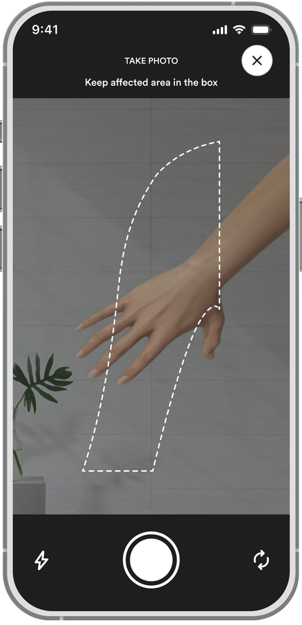
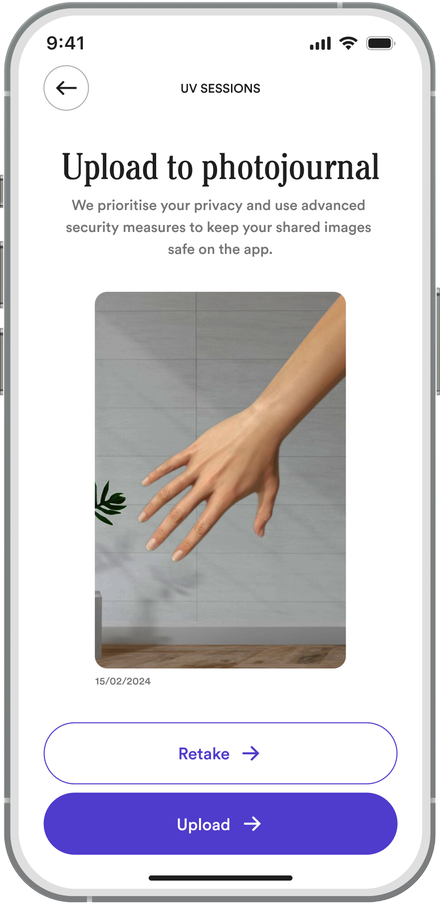
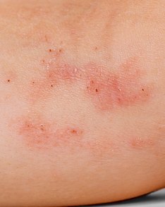
Dosage became a body map. After each session a photo goes into the journal, so progress is visible between dermatologist visits.
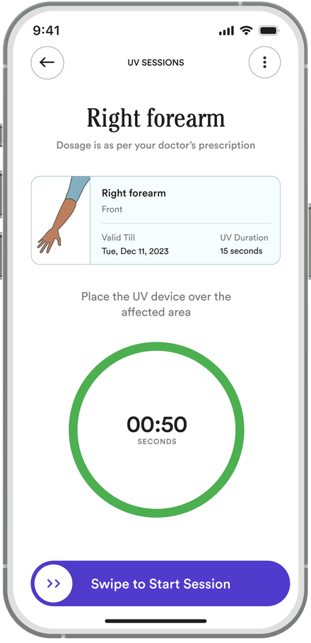
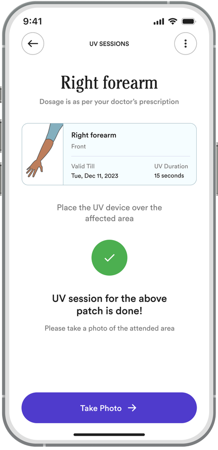
01Pick today’s patch
02Timed dose, set by the doctor
03Patch done
04Photo of the patch
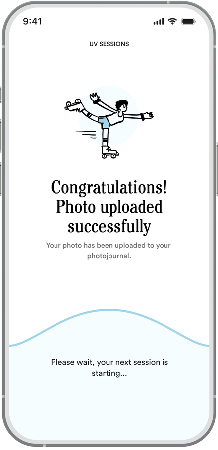
05Saved to the photojournal
06Next patch starts
PhotojournalRight forearm
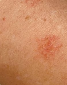
Right forearm in week 1: several red, scaly eczema patches.Week 1
01/02
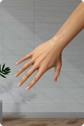
Right forearm in week 2: two smaller, fainter patches.Week 2
08/02
Today
15/02
Diet04]

Built for Indian kitchens instead of calorie counts

Built on Theme 02: care is cultural

“I just want to eat what I like”

That was the first thing a patient told me about food. So we didn’t build a calorie counter. Recipes are built around Indian meals and checked by clinical nutritionists.
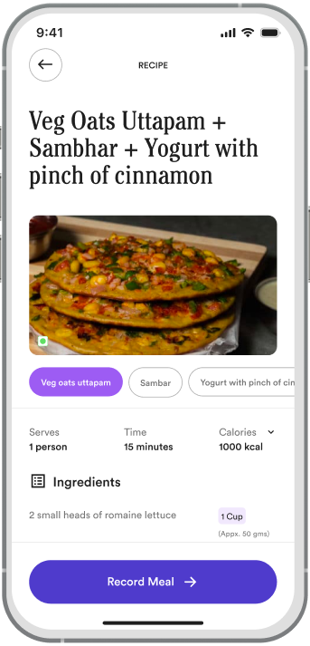
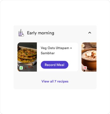
The recipe screen: Veg Oats Uttapam + Sambhar + Yogurt with a pinch of cinnamon, with ingredients and a Record Meal button.
Recipe screen

Logging a meal in 15 seconds, even when you ate something else

Pick the meal, confirm the portion. If they ate something else, one more tap logs what they actually had.


Adding a meal
Meal options
Ate something else

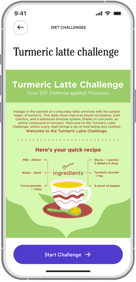
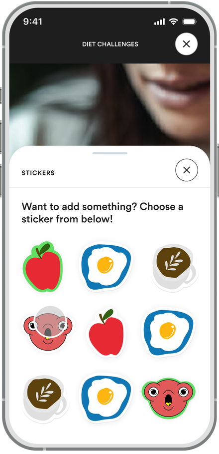
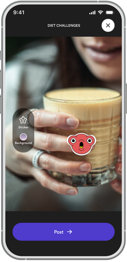
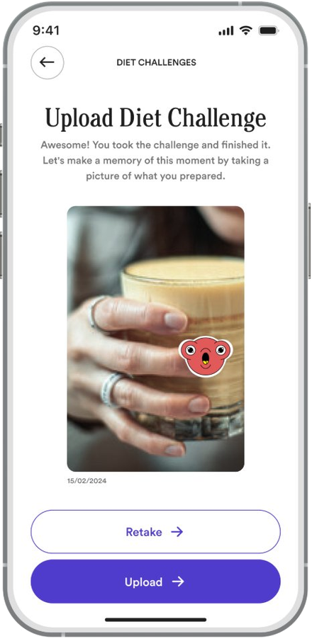
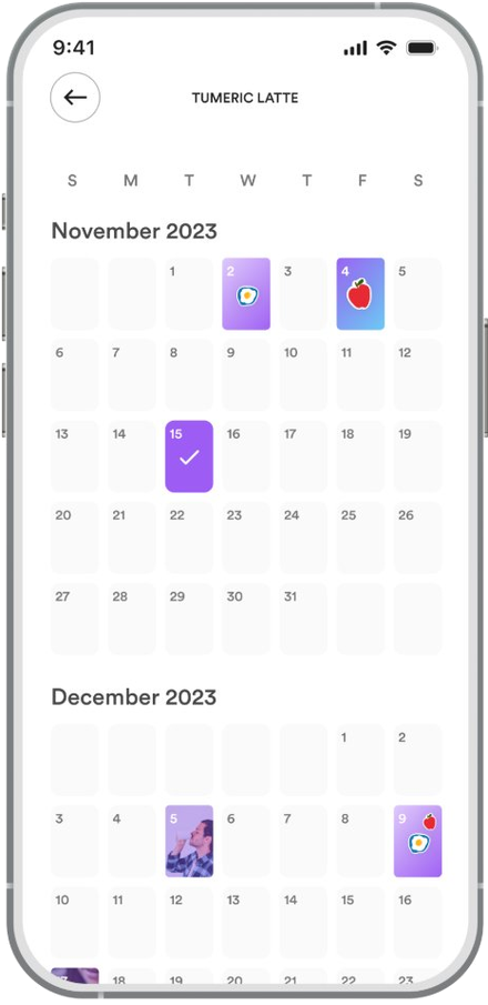
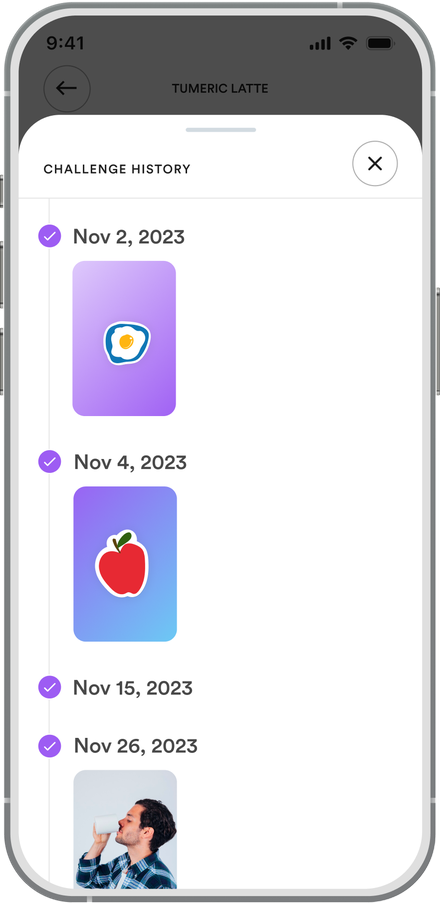
Challenges that forgive a missed day

Streaks reward consistency without punishing breaks, because chronic care is unpredictable.
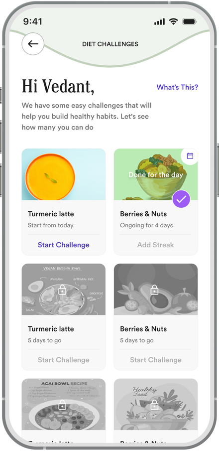
Interaction states

Three states of a 15-second log

The plan suggests a meal, but people log what they actually ate. Each state has one main action, and none of them tells you off.

Early morning
Veg Oats Uttapam + Sambhar
Veg oats uttapam−1+
Sambar−1+
Record Meal
01 PlannedToday’s meal, portions pre-set
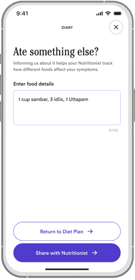
Ate something else?Helps your nutritionist see how foods affect your symptoms.Enter food details
1 cup sambar, 3 idlis
Share with Nutritionist →Shared with your nutritionist
02 Ate something elseTyped in plain words, shared with the nutritionist
Early morningMeal Recorded
Uttapam ×1
Sambar ×1
This week
M
T
W
T
F
S
S
6-day streak · Friday forgiven
03 LoggedA streak that survives a missed day
From our earlier iterations
✕ Earlier iterationStreaks that reset to zero
✓ What we choseStreaks that forgive a missed day
BecauseChronic care is unpredictable. If one missed day resets the streak, people tend to give up.
Wellness05]

Four taps instead of a therapy app

Built on Theme 03: apps ignore the person

Shipping the smaller version

I wanted journaling, a peer community and therapist referrals. The clinical team questioned whether a UV companion should go into mental health at all, and they had a point.

What shipped was four-tap mood logging with coach-reviewed content, averaging 2.6 entries a week by week eight.
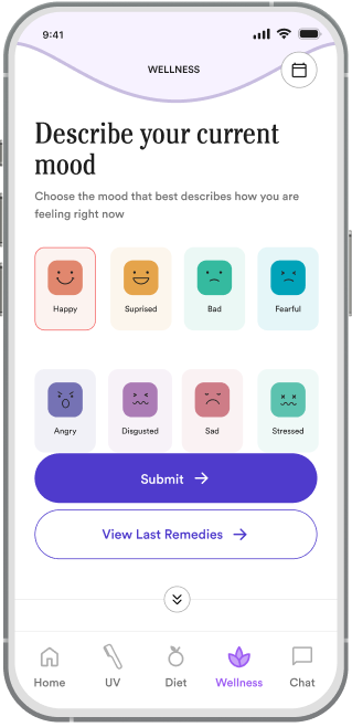
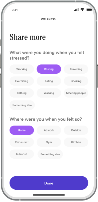
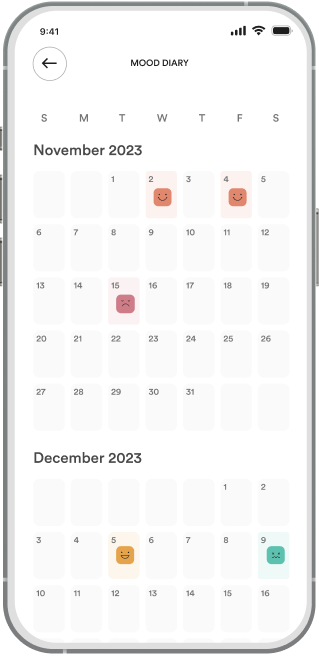
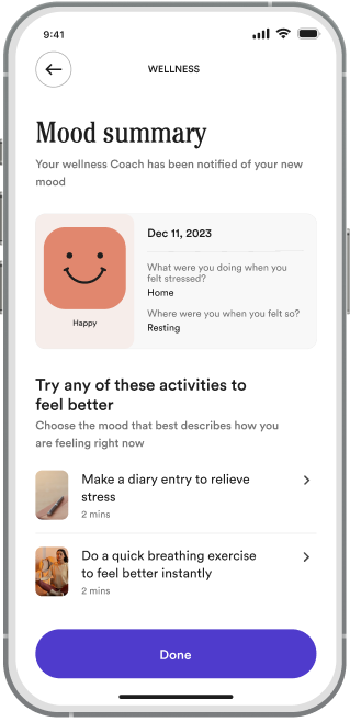
01 Pick a mood
02 What and where
03 Patterns over time
04 Support
From our earlier iterations
✕ Earlier iterationJournaling, a peer community and therapist referrals
✓ What we choseFour-tap mood logging, reviewed by coaches
BecauseThe clinical team asked whether a UV companion should go into mental health at all. The smaller version shipped.
/ Validation

Usability testing

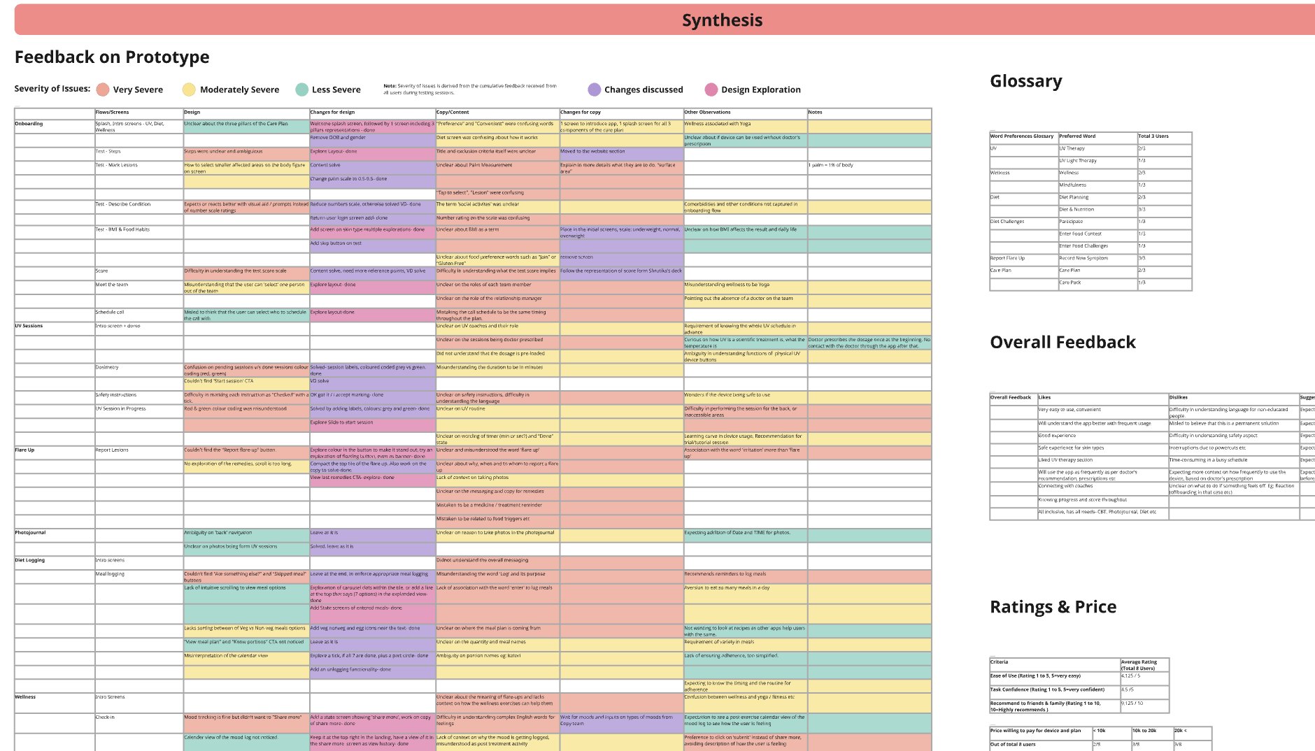
Six patients, eleven tasks, moderated on Zoom. 350+ observations in Miro became 50+ insights and eight fixes. We shipped the fixes, then ran the same tasks with the same six people.
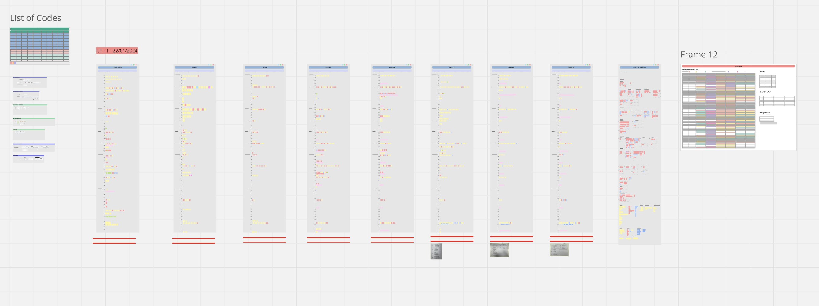
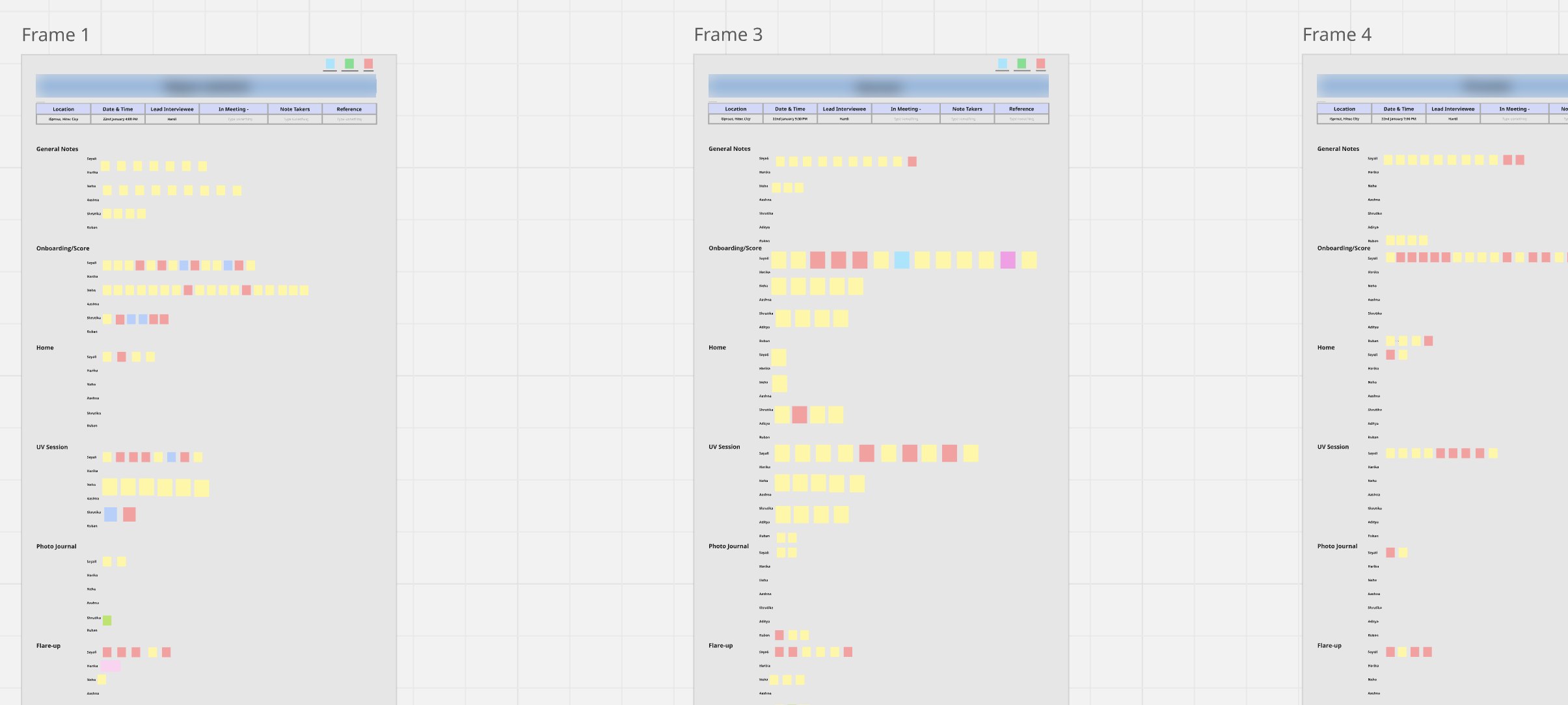
The usability testing board in Miro: a list of codes, one column of observations per participant for round one, and the synthesis frame.
Round one of usability testing in Miro, one column per participant
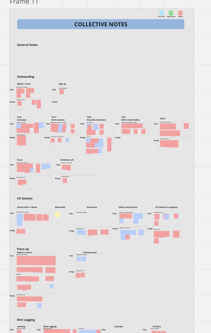
Observation frames, one per participant, coded by app section
01 Observe350+ notes, one frame per participant, coded by section
Collective notes grouped by flow, copy and design, coloured by severity
02 Bucket20 sections by flow, split into copy and design issues
Synthesis table: each issue with severity, the change for design and the change for copy
03 Synthesise50+ insights ranked by severity, 8 fixes shipped
MeasureRound 1Round 2
Task success (55 → 62 of 66 attempts)83%94%
Tasks failing 2+ times 30
SUS (digital health average 76.6)71.278.4
Ease of use (out of 5)4.14.6
Likely to recommend (out of 10)8.38.0 ↓
The eight fixes
01Fix legibility across the app
02Make the meal-log and flare-up CTAs primary
03Explain how patches are measured in the test
04Simpler wording, with full context
05A simpler score scale in the psoriasis test
06Resolve accessibility issues
07Brighter colours overall
08New flows for the pain points we missed

The app got easier to use, but that doesn’t mean people wanted to use it more. And since we tested the same six people twice, some of the gain is just them knowing the app better.

/ Impact

Eight weeks after launch

Before any screens existed, we agreed with Dr. Reddy’s on what success meant: adherence as the north star, device setup as activation.

68%adherent at week 8against a published 31.5–62%
79%adherent at week 4the north-star metric
3m 40smedian sessionmedian session, on target
4.1active days a weekout of 7
Adherence, against the published rangeShare of patients completing 80%+ of prescribed UV sessions. Both checkpoints sit above the best published result.
0%25%50%75%100%Published range 31.5–62%Week 479%Week 868%
Device onboardingEvery step dermatologist-assisted. 91% of patients finished setup.
App opened100%
Paired96%−4
Test done93%−3
Setup complete91%−2
A daily ritualActive days in an average week, weeks 1–8. Most apps in the category are opened during flare-ups only; 11 of 16 patients said so.
MTWTFSS
4.1days a week
Usability, same six peopleSUS score before and after the eight fixes, against the digital health average.
60708090Digital health avg 76.671.2Round 178.4Round 2
Weeks 1 to 8, 1,260 patients in one cohort with no control group. Adherent means they finished at least 80% of their prescribed UV sessions
/ Reflection

What I’d do differently

I designed the streaks for the wrong person.

Forgiving streaks were meant to keep the Experienced Warrior from dropping off. That group still dropped off most. Someone twenty years in doesn’t want a streak at all.

Three cards for three personas was a compromise.

Every persona got a card, which meant nobody got a home screen that was really theirs. The braver call would have been to pick the one behaviour that most needed to change and build the whole screen around it.

One screen carried too much.

The Skin Health Index was the reason to return, the gate to device setup and the coach’s baseline. Three of six participants got stuck on it. Splitting it up would have added a step, but fewer people would have got stuck.

People don’t usually quit health apps because the app is bad. They quit when it stops feeling personal. We designed Daily Bloom for the patient on day 60, when the main reason to open it is that it still knows their history.
/ More work